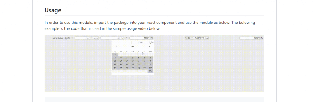
The first coding practice that learners do involves asking input from user, accepting that input, processing and manipulating it and displaying the output. This is how all journey of programmers begin. But, as we develop the skills we realize that it isn’t a good practice to give users wide freedom while entering data. It should be as narrow as possible along with proper layout. For an example, consider a user is filling a form involving date of birth. Allowing them to enter that in a text format compromise the whole data set. In above may cause abrupt processing of the system. A quality input results in quality output. In the same way, all the system in today’s context will prefer a react or other datetime picker component. If time instance is also necessary use the react time picker or only datepicker but by default most uses both datetime.
React offers a number of component as time and date picker to simplify input and processing procedure. Not only web and mobile application but simple animation layout use component of react datetime to create cool screen saver screens, stand alone gadgets or combine with other components to achieve something more. To find out more on what other things are there to offer stay with us till the end of the article. Also, make sure to check other helpful contents on web designing like ones below.
15+ React DateTime and Date Range Picker Components For Developer
Today we bring to you a number of react component for datetime selection for any filter, form or sticky UI component. You may require only a date picker or a time picker or both, nevertheless we have a range of react examples below which will meet your needs. So without any further ado let’s get things started for the day with a most comment calendar layout.
Related
- React Font Icons for Web
- 3d fold animation with css and javascript
- 10+ Date Picker For Bootstrap
- React sticky header component
- React loader, spinner and progress bar
1. Input moment
The first example of react datetime picker is same as a classic reminder application. The datetime picker consists of a label to show day of the week, date and time for current selection. However, its only for displaying purpose and users can’t edit it from the label itself. Its the reflection of selection result from calendar layout and time as it should be.
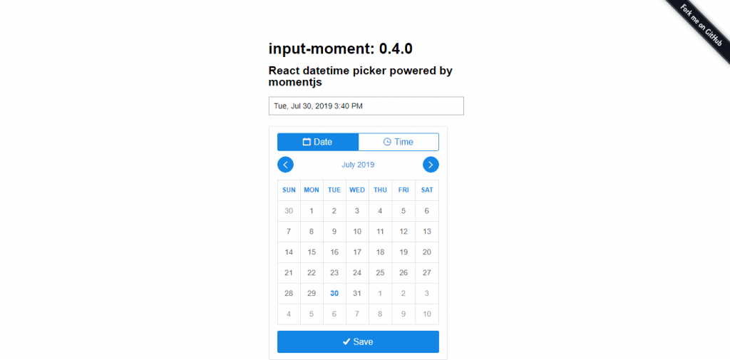
The layout is very popular among a number of applications requiring calendar view with easy previous and next navigation button. Only the present month’s days are in active colors while rest looks disabled. The dark blue font color shows the current selection. The time option is rather different allowing selection by a linear slider option. However, the selection unit gap is 5 minutes for minute hand and 1 hour for hour hand.
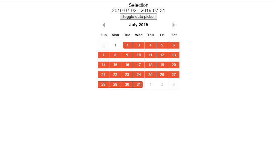
2. React date range
While on the previous datetime picker example we saw a single calendar layout for one time event like alarm, this react datepicker is for a range of dates. There are only few situations where an instance is significant whereas, most the tasks and reporting comes for a duration of time. For an example consider an accounting application where you wish to see all transactions. Selecting a date and a time is of no meaning since the transaction can happen at any moment of the day and you can’t expect to check 1440 moments of a day to know more. Transaction from start of the starting day to end of the ending day are shown in the application by simply selecting the boundary dates.
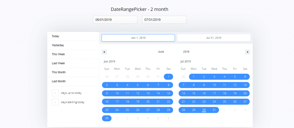
Talking about the layout of the react datepicker, its interactive with users to almost all context. We have the option to know present date by a different color font or track some other date in same fashion.In order to ensure that the users haven’t picked a wrong date range, the calendar highlights the range of selected date. The UI itself act as a checker due to this feature. Moreover, the datepicker has the feature of days count till today or from today like that of a countdown thanks to react.
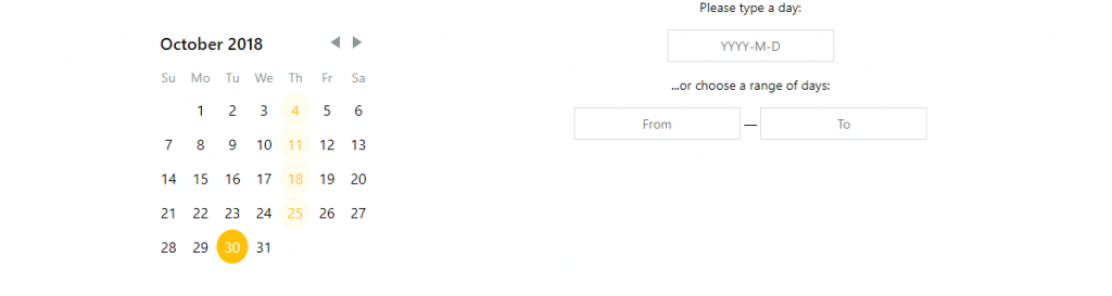
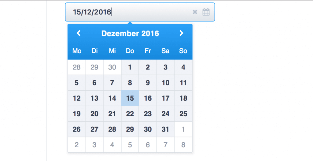
3. React Date Picker
The react date picker is a simple solution to user interface requiring date. As we said earlier, the user control over the input must be as narrow as possible and direct to the point. Such datepicker component from react enables the system to accept correct data format always. You can’t pass John or hello or 1234 as input since user can’t even type in this case. They simply have an option to select from calendar view of specific date and the rest is done by the system itself. This maintains consistent and valid input to the system.

The calendar is navigable from arrow also making its operability even more simple. You just need to click on date selection layer that drops down a calendar format. From this you can easily choose the date easily that reflects on the date option layer while closing the calendar automatically.
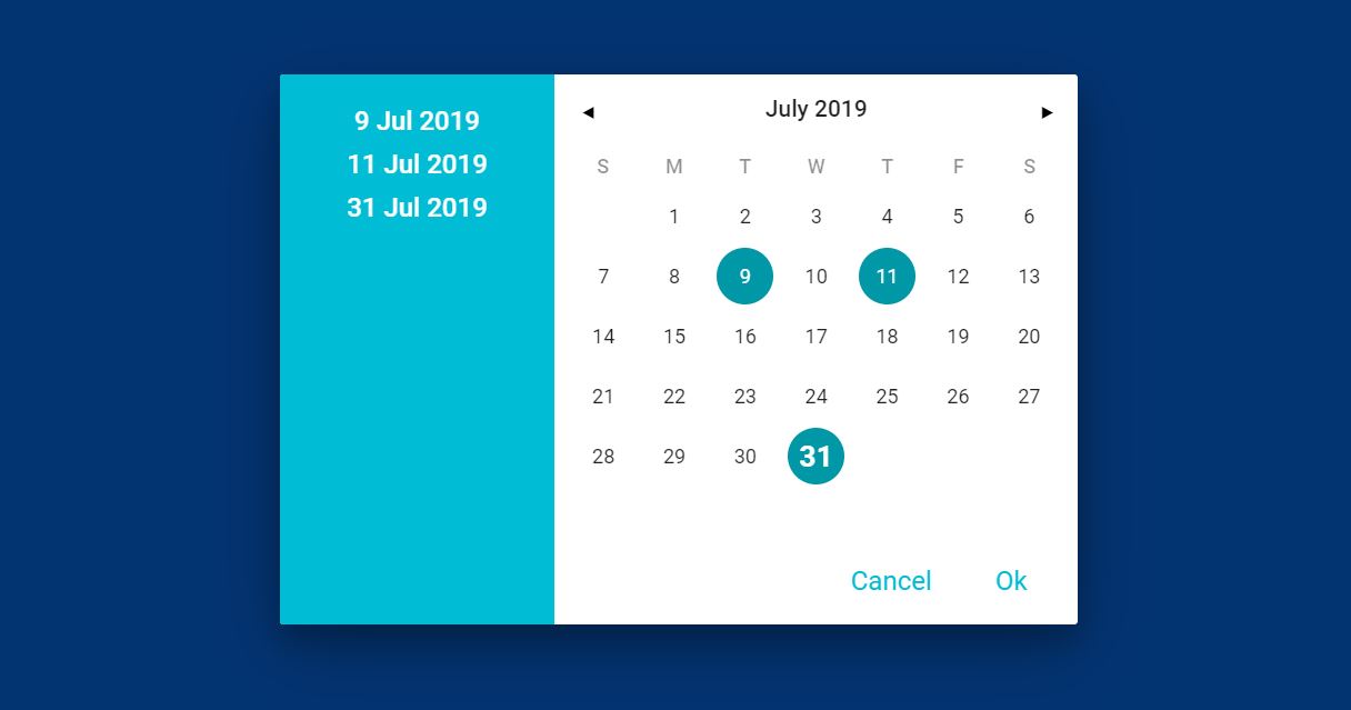
4. React Multiple Datepicker
All the examples that we have seen till now serves a different requirement with this being no exception. So we have seen date picker options for single instance and range of dates but what if you need a mix of both. Not completely an union of both react datetime picker but a portion from each. Like you don’t need to select continuous range of dates but require multiple selections. This react multiple datepicker serves you for the same purpose.
As we have seen by now all the react datetime picker layout are that of a calendar with easy navigation options and easily distinguishable contents. This is makes sense that calendar and date are interrelated components and universally same. The date selection is reflected by a circular and different colored background with listing on side bar as well. Its the exact copy of marking multiple selection on actual wall calendar that we used to do. This makes the use for reminder and tracking related application very familiar.
5. Month-Picker Component for React
The month picker shows the multiple styles to select a month or range of months. While it may not seem too different from previous examples, the real function comes from its filtering ability. As you can see in the demo image itself, it says that only certain range of options are available. This adds an extra benefit to providing only valid data to the system. The calendar view initially accepts only a valid format of data and in addition to filtering option we can ensure no unwanted operation is in option.
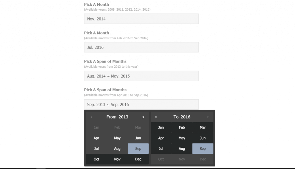
Talking about the implementation of this react date picker, consider a movie management application where admin is responsible for adding movie details. This also means that they are responsible for selecting release date, show times and so on. So, is it logical to allow them to set a release date or show date a week ago from today or allow users to purchase ticket for movie show a day before? This is just a simple example for date validation. This will be useful in many more applications. Adding react time option to make datetime picker would be an enhancement to present offering.
6. React date time picker component
We can use this react datetime picker component straight into screensaver or a mobile gadget. The layout is beautifully crafted to appear as a work of some good interior designer. The usual calendar layout with real time clock can be often seen in home page of many mobile users along with some weather information.

This react datetime picker component has the navigation option to either of adjacent month or adjacent year. This makes date selection very easy and if you feel returning back to current date will be an issue then don’t worry it won’t be. This is because the react UI component for the datetime picker comes with one click option to return back to current date and time.
7. React Daterange Picker
The react datepicker with toggle nature brings the aroma of efficient space utilization and beautiful UI option to the cart. The feature for the date picker consists of intuitive way of selecting the date range reflected in UI itself. The filter option that we just discussed on can be defined as a step of validation. Moreover, the react datepicker component has the capability to visually represent half day states as well as show any number of months at the same time.
The react based date range picker is compatible with latest versions of react like 0.14,15 and 16. The styling and functionality of the date picker is useful in appointment management application where available dates are highlighted with one color and filled dates with another. More on this from code below.
8. React Dates
I’ll say it again that every application should limit the user ability to control the input within a prescribed environment. The next example of range date selector asks user to input the starting date from calendar layout and then navigate to end date or vice versa. While doing so, after the first selection range of dates are automatically highlighted to show number of days the range covers. Hence, within an instance the user gets idea about the duration that will assist in further decision making.
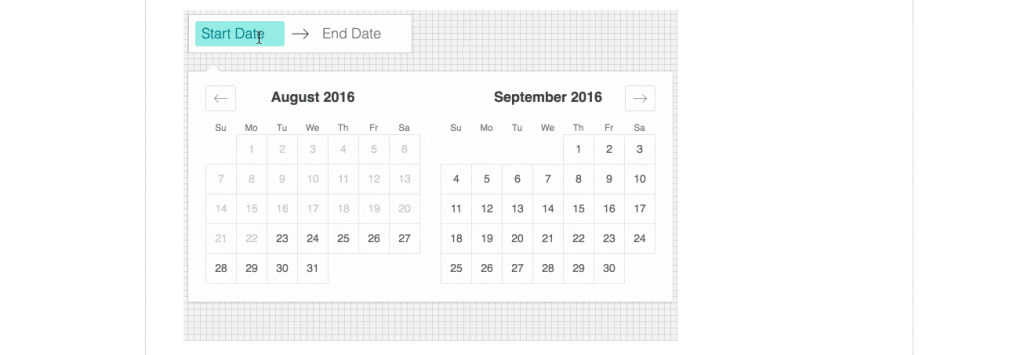
The react datepicker is also available for language such as Chinese and Arabic where the component lies on left hand side. Moreover, toggle effect, initial hidden visibility along with custom vertical height are among other features.
9. Datetime picker react component
The two in one date selector is popular react component with 30,000+ usage. The react component can be used as datepicker, timepicker or both at the same time with highly customizable option. While most of the react timepicker allow only hour and minute selection, this one can go up to milliseconds. This makes the react datetime picker component usable up to timer and countdown level.
10. React day picker
The react day picker is the top choice for any plan management platform. It comes with highly customizable function with ARIA support and no external dependency. Above all, these comes in a 9 KB package so its lightweight as well. This react datepicker covers most of the basic needs for date selection of web applications.
The react datepicker offers definition of each individual day with modifiers. Styling involves disabling for selected days, changing aspect of each day cell. You can either choose a calendar view or if you’re running out of space select an alternative input component. In addition to all we can localize the calendar by using own translation strings.
11. React flatpickr
The timepicker component for react app is like a simple time gadget that we all have in out mobile device whether in homepage or as a screen saver. While it may seem like a normal text field; its packed with internal validation query. The react timepicker is in 24 hour format so you can only enter 0-23 input in hour field. This means you can’t even enter 3 in the ten digit place of hour field. Similarly, the minute field accepts data from 0 to 59. Same applies for second field.
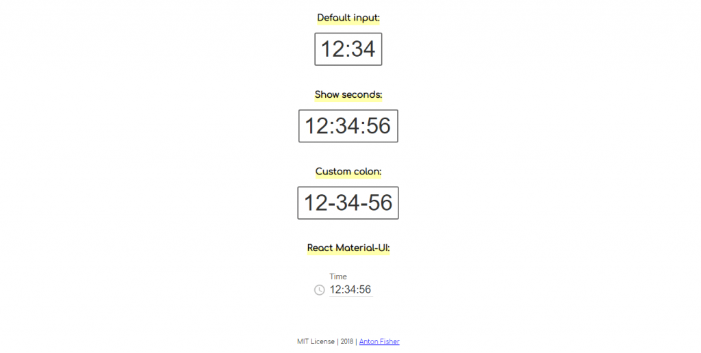
With four different styling options available you can choose any format for time display. Moreover, a clock icon with time label makes the design more appealing.
12. React DatePicker
The react datepicker example is a default calendar view for most of the android devices. The statement itself is enough to express its property of internationalization. That it, the calendar comes with different language options using locale props. The major highlights of the datepicker are range selection option, standalone calendar and customization with styling. Its built with typescript, sass and react with dependency on moment.js.
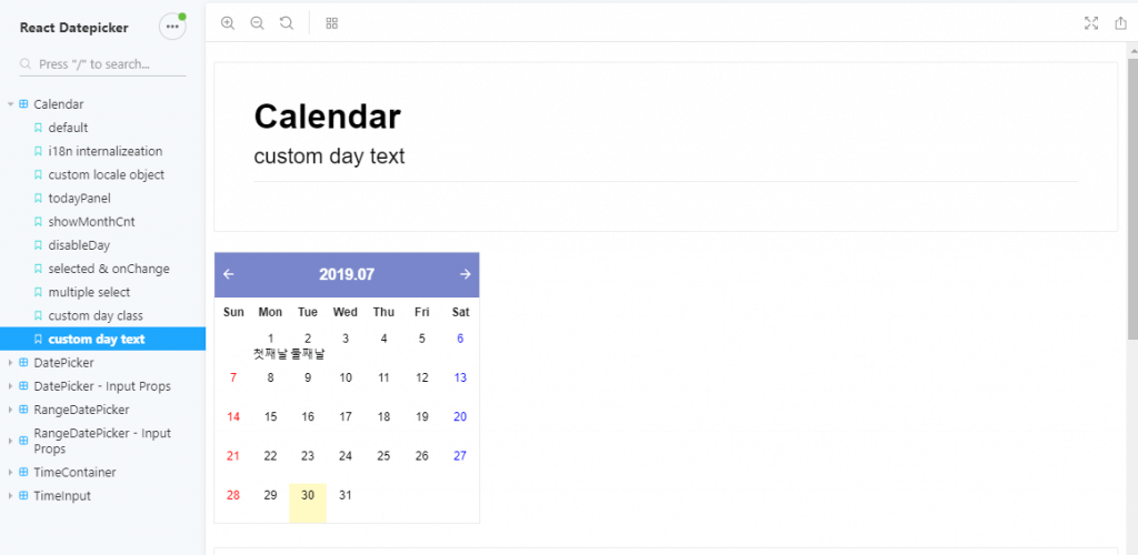
Summing up all the features of the datepicker, we can select multiple dates on calendar with clear option to get into initial mode. Each date can be labelled with custom caption that shows up in the calendar itself. Moreover, current day can be shown with today panel and active background status. You’ll need to check the documentation and demo yourself to know about all the detail from link below.
13. React bootstrap date range picker
This is a pure react port of bootstrap date range picker. We have two options of selecting a linked two calendar view or go for a self sufficient single calendar. Both of these calendar are functional in their own way. While it may be easy to select a range of dates for more than a month using linked calendar, the unlinked calendar occupies minimum space and looks a better layout.
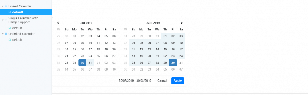
By the looks of the calendar it seems as a normal calendar with not much internal control. However, you won’t be able to select start date from beyond today for any range selection. Simple hover from today’s date to next days slightly highlights the range as preview before selection. Other features include localizable strings and date formats, a single date picker mode, a time picker, and predefined date ranges.
14. Advance React Date and Time Picker
The advance react datetime picker is a dropdown calendar menu which offers localization, multiple date selection and range of dates. You can choose a datepicker or timepicker only or both as per your project requirement. Initially the demo version consists of 3 types of persian calendar option which can be further enhanced to support world wide calendar formats.
More on the features and demo from the link below.
15. Pretty date picker with ReactJS
By name and the looks the datepicker is a pretty and decent component made with react. Nevertheless, if you’re not satisfied with the default layout you can use your own customization code in the style sheet. The dropdown calendar is useful in any form or date filter layout. Days of present moth are indicated by dark background while white background for dates of other month indicates disabled dates. Moreover internationalization has become a must as per examples we have seen above.
Navigation using this calendar layout is more simple than you can imagine. The most common navigation option is to use left right pointer for traversing to adjacent months. If you select the present month label then the single month calendar collapses into a 12 month selection layout. Further year selection collapses into 12 years layout exhibiting drill down and drill up options. You can get to a specific date or wider range of years using this feature.
Conclusion
Selecting a date and time may not get more simple and effective than examples shown above. Date and time are among those input which fall under a fixed set of selection. There can be multiple validation rules and format accepted by system so using a consistent layout for user takes incorrect input form out of equation. Moreover, they are good user interface and dashboard component giving away informative contents.
We hope we solved your query on date and time picker for your application with our article. Stay with us for more on similar and amazing contents.