Wana know about CSS Grid System? Worried it may be difficult? Then you have no worries because today we are about to learn about grid system used in CSS. CSS grid system in considered as on of the most powerful layouts that is used in CSS. The process in which both dimensional system are used. It simply means that it can handle both the use of row and column. With the use of grid system in css websites has never looked great. Grid system are used to solve layout problems that most of us has been ignoring while we make website. In grid layout there are two elements one is parent and the other one is child. There is only on parent element but that parent can have one or more child element.
Use of css grid system is used in order to make the website look lot better than before. The use of two dimensional makes it more reliable than Flexbox. As Flexbox has only one dimensional layout. When it comes to grid layout of css then we can make the comparison much easier than before. Flexbox can’t use two dimensional system but if you can make both grid and flexbox work together then it will be able to save and help you with the layout of your website. Grid was the very first module which was made to solve layout problems that we might have been ignoring or doing it the hard way.
Related:
Ultimate CSS Gradient Code Generators
Top 10 CSS Frameworks For Web Designer
Text Hover Effects CSS Animation Snippet
25+ Best Responsive Bootstrap Navigation Menus
Responsive CSS Grid System For Better Web Design
The way to get started with grid layouts we must first know how to define a container element as a grid. It can be done with the help of display: grid and then we can set up grid-template-column. Once the column is done we move towards the row for that we can use grid-template-row. After we define the container elements we must place the child elements. For that you can use grid-column and grid-row. Some of the terminology of the grid layout are Grid Container, grid item, grid line, grid track, grid cell and grid area.
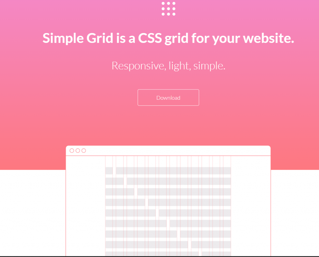
1. Simple Grid-CSS Grid System
Simple grid allows you to make 12- column css grid which allows you to make your websites make more responsive websites. They are lightweight so it is easy and fast way to include in the website. In simple grid there are different columns which is contained within rows. Those rows are again contained within a container. Container on simple grid have the maximum width of 960px. When you build these grid you don’t have to break anything to edit. Editing with simple grid is simple as the codes are much more familiar.
While we build with simple grid all the grid are built on mobile first which makes all the column expand to its full container width on smaller screen. If you are not designing your website for smaller screens then you can simply add one code add -sm to the end of your column class name. Using simple grid is easy and you can get more responsive website. This css is much more lightweight and can reduce the problem of adding to load time on the pages.
2. Fluid Box Grid-CSS Grid System
This grid system is based on flex display property. It is one of those grid system which are more responsive as its modifier makes the specification of different column sizes, alignment and distribution easy because it is viewed at xs, sm, md and lg viewport widths. With the its fluid resizing we can resize columns and rows on percentage basis. It is one of those grid layouts which have very simple syntax. We only need to remember are row, column and content. Using very simple codes usually 3 to 4 lines can help you offset any column as per your requirement.
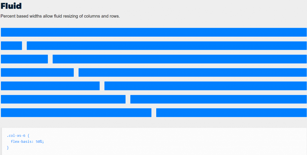
We can also use its function on which adding any number during auto sizing columns to a row is much more easier. If you want nested grids in the website all you need to do is use some simple codes and you have grids as your requirement. Aligning the grids has never been any simpler as we can just add classes to align elements to start or end. Distribution may be a little tricky but with fluid box grid it has not been easier. There are lot of other function that you can check out on the website for yourself because it is nothing like you have seen before.
3. Raster Simple Grid System
In raster simple grid system there are number of columns which has been specified by columns attribute. Single column is already created by the cells by default. The main use of that cell is to customize where cell can start and how many columns it spans. When it comes to other grid system they may not be pure css and may contain JavaScript but raster is pure CSS. Raster grid system are very responsive. The use of span -s attribute defines layouts which can be used inplace of the original if it is more suitable. This is the option that shows when your design is presented on small screen.
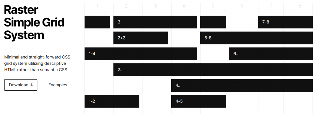
Codes like raster.grid.css can provide less set of grid functionality. It is easy to use and edit because it is open source and all of its codes are uploaded to its github. Raster is a complete framework for css and provides much simple and good starting point for new websites. Most of the raster files are zipped on 5 kb size.
4. Responsive Grid System for better Grid in CSS
Repansonsive grid system are one of those websites which are used to build quick and flexible responsive websites. Using this system we dont have to worry about having fixed number of columns. When we use this system we can have them placed according to our own need. Using this system allows you to scale your grid to any scale as it uses percentage. As most of grid system may requires some twitch but in this system we dont need to does that for you. You don’t have to worry about fitting content to the grid because you can simply make grid fit to the content.
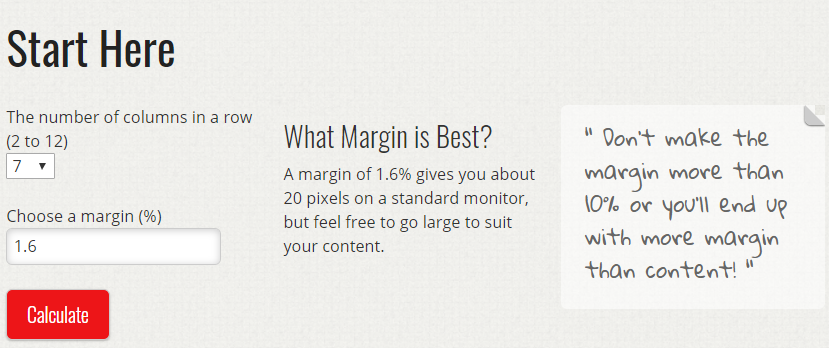
Using this system will make your website building experience more easier and faster. When we use this system all you need to do is give your input and then the system will note only give you css code but also will give you code in HTML. This system even give you detail knowledge about how it works. This is one of many best things of using this system to create grid system on CSS.
5. CSS Wizardry Grids -CSS Grid System
Some grid systems are very complex to use and take a lot of time. When you are falling behind your deadline then you can’t go after those systems. You need very reliable. Using wizardry grids we can make combination of nested, gutterless, centered and all kind of grids with the help of this grid system. All the classes of this system are used on html which make the developers work simple and easy. MOst of the integers represents high-level grid item that you may need for your website. If any decimal are represented then they are represented in the grid item’s level of nesting.
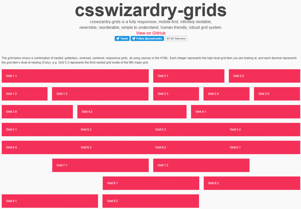
When you use this grid system you are bound to use it for a long time. This grid system is much more simple and elegant. It saves time and makes the work look much more satisfying. System help to make the grid according to content and auto sizes accordingly. CODES
6. Profound Grid– Grid System for CSS
As websites nowadays need to be more responsive there are several ways you can do it. Some of them are hard to do but some are easy. Seeing that we need easy and more reliable way we will see profound grid on this topic. Profound grid are more responsive than most grid system. You can do various tasks such as removing and adding media layouts. You can also add or remove gutter width as per the requirement. This system doesn’t require classes like grid_x to keep your semantic work.
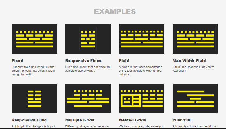
To calculate margin this system uses negative margin. Websites that use profound grid will work the same on all the browsers. You can make grids fixed, responsive fixed, fluid, push/pull according to the requirement of the website. You can download codes and also view them on GitHub.
7. Neat-Lightweight and Flexible Sass Grid
Neat-lightweight and flexible sass grid is more flexible and lightweight grid system. This is the perfect way to create website and make the work much more easier. Using this system make the website loading time faster and doesn’t collect cache as others. Installing it on some languages may be different and may require unique codes for the you. Codes used during installation are very simple and easy to remember. For example if you are ruby user than use “gem “neat””.
Using this system is very easy and makes other grid system look much more difficult and time consuming. Use of this system will give to great time and also save you time. Documentation||GitHub
8. Extra Strength Responsive Grids
Extra strength responsive grids are one of those grid system which are percentage based. They are very fluid and easy to use. Alignments on this grid system is easy because you total control over normal columns. Classes used in this system are very easy to remember as they are not so long. This system can be used to make amazing prototypes. Extra strength grid allows you to nest grids inside the grid. This is important as because sometimes grids can be within nested grids.
As this system has SASS enabled this can make grids as much as you want. It makes the customization of grids much simple. This system may look like it is not easy to use but if you keep on using it will get more easier.
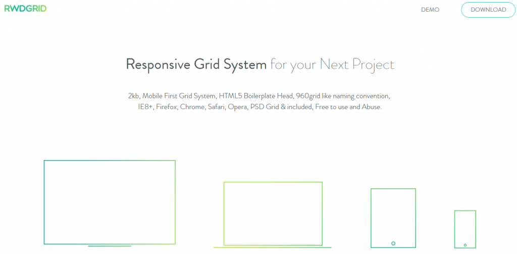
9. RWD GRID – Responsive Grid System
RWD Grid is on of those grids that makes the website building much more easier. In this system we can see that it can adopt to screen size an orient on its own manner. Like most responsive grid systems it very easy and flexible to use. Most of the codes are simple and can be used on almost anywhere. If you want more responsive system than you can to the right place. This system makes the work of developers work much more easier. The popularity of this system is increasing by the day.
10. CSS Smart Grid – Make Lightweight and Responsive Grid
This grid system is build on popular 960 grid concept. This makes the process of making more responsive website much easier. It uses the grid that says mobile first. It is very lightweight as it only weight around 0.65K. As the updates came along this system now supports percentage based flexibility which makes the resizing of row and column very easy.

More flexible work can make the work much faster and the website look much better. This system also supports SASS which can make the work much more efficient.
11. Griddle -CSS Grid System
Griddle is a grid system in which fluid and modular system are used for modern browsers. This system uses inline-block and box-sizing which can provide features that float-based can’t. In this system you can find that it is simple to make grid nesting. In griddle you can find the easy control of horizontal centering of cells along with little control on vertical alignment. Grid can provide combination of fixed and fluid contents.
The use of griddle can be more or less the same as other system but one thing makes it better than other. It has much more flexibility than other system. As this is new in the market it still have lot of places it can make changes and improve it quality.
12. Pure CSS
Just by reading the topic must have given you little knowledge about the grid system. This system is so small that it only occupies 3.8KB minified and then is later on gzipped. This system was designed for mobile devices. File size is only 3.8KB because of the mobile devices. The main use of this system would be saving size on the device. Although you have to write most of the coding it is not so hard and can be done quickly. Keeping in mind that codes will not get in the way of designing your very own grid without having to make you own system.
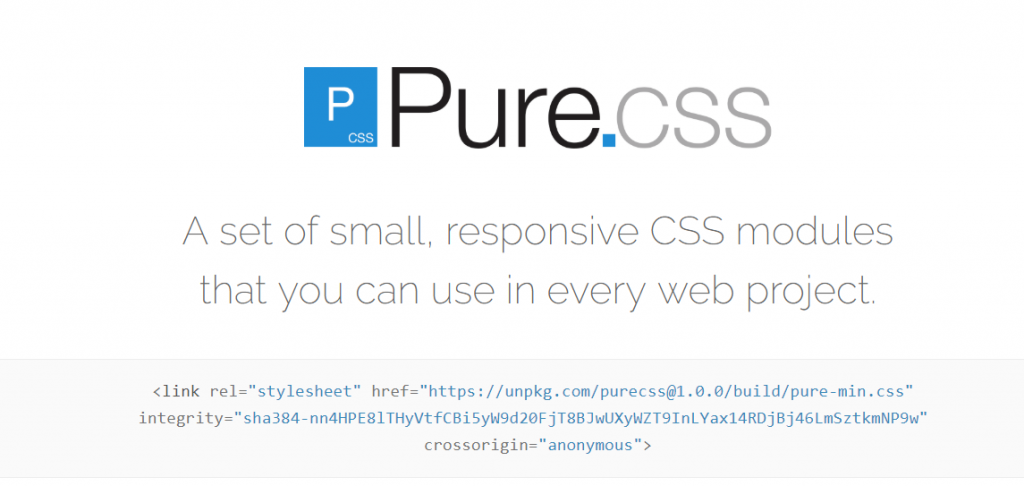
With the help of pure we can make more creative response. You can make the grids as per you own sizes and as per your requirement. This may seem like lot of work but will help you a lot as the development will be completely based on you.
13. Grid by example
This is not so much as a system as this only shows you how to use grid. First you will have to define grid by giving new values to the grid. Then you will have to position those values on the grid using line numbers. After positioning grids you now have to use grid properties. Then place them on grid tracks which can span om more than one. Then we can use the span keyword to specify start and end lines.
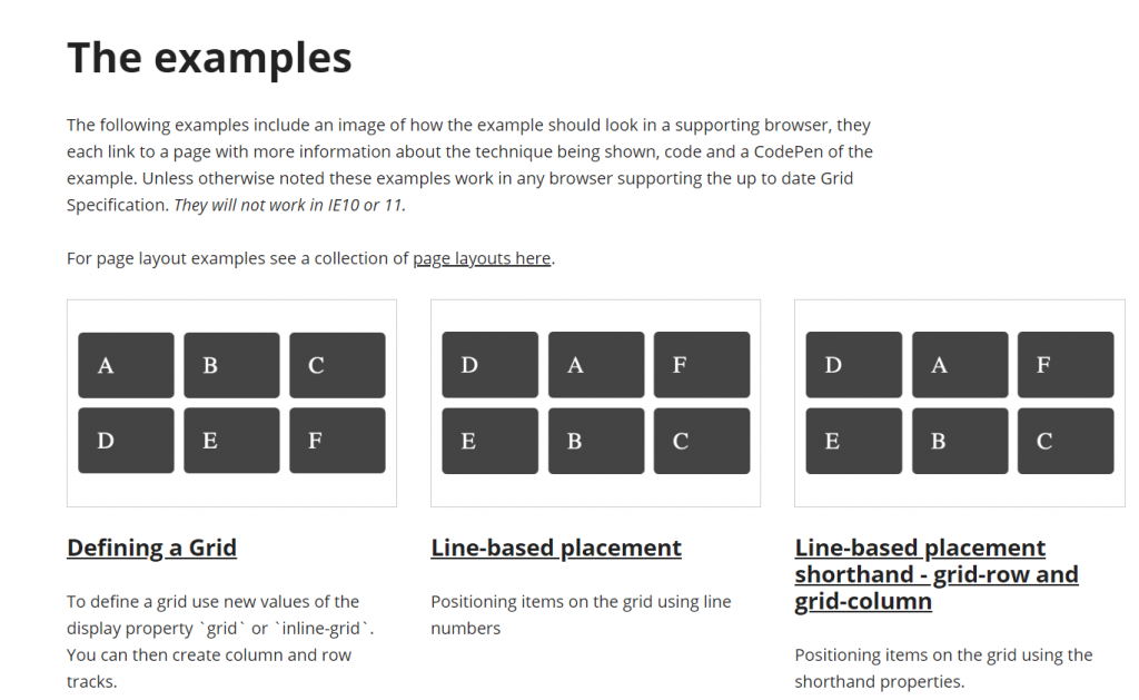
Following steps is not so easy but once you are used to it it gets easy. The use of grid by example is not an easy task but it gets easier. When you get your wanted output you will be able to get satisfied results.
Conclusion
Using any of the system can give you your result. But if you choose what you want the most than you will get more satisfaction. Using tools above can make lot of changes to the website. It will be less time consuming and will make website look better. Grids are simply a way that can design your website look more professional. Grid simply means how you can use two dimensions to make you website look good.