When it comes to website, its accurate navigation, beautiful layout and great content that primarily matters for good user experience. While you need to do your own homework for the contents, we are here to assist you on other departments. We have a number of articles for good navigation option and great layout. This article is one of the same dealing with both navigation and beautiful layout. However we need to give more weightage to layout in this article with navigation occasionally getting involved. So, what are we talking about? Its the bootstrap examples on sliding panel in css and html. Not entirely pure css though since we may have few panels involving javascript as well.
As we just said we need to give more weightage on layout than navigation because most of the content could be the last line of navigation. Panels refer to bordered box with some padding around its content. Its one of the many ways to properly utilize the space while trying to deliver as much as possible. How? Well you need to stick with as and read the article till the last to find out answers to all of your queries.
Beautiful CSS Panels Examples with Source Code
We have handpicked examples on bootstrap panel in html and css along with full demo and code for you. With these examples of css panel we believe you will be able to give a great layout to your website that might also support for amazing navigation. It specially deals with the images and relevant content delivery. However this doesn’t tell the complete story and you won’t know it until you go through these set of examples.
Related
Drum rolls please because ladies and gentlemen we proudly present to you collection of panels with css, html and javascript for a beautiful we layout.
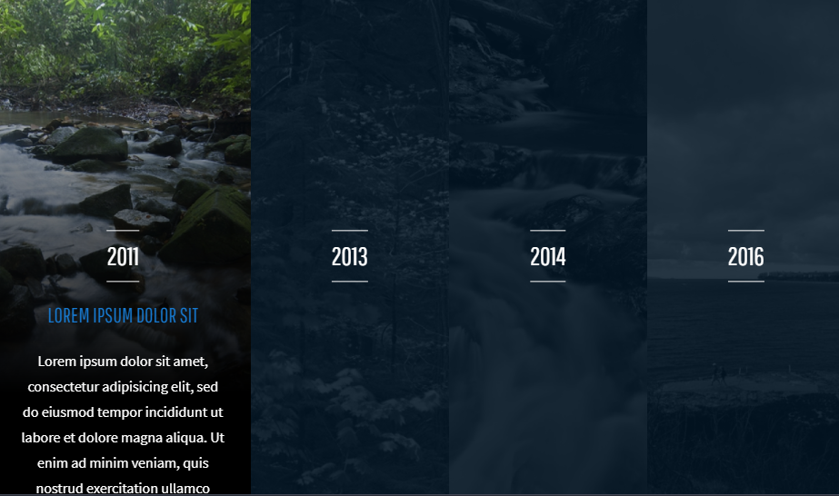
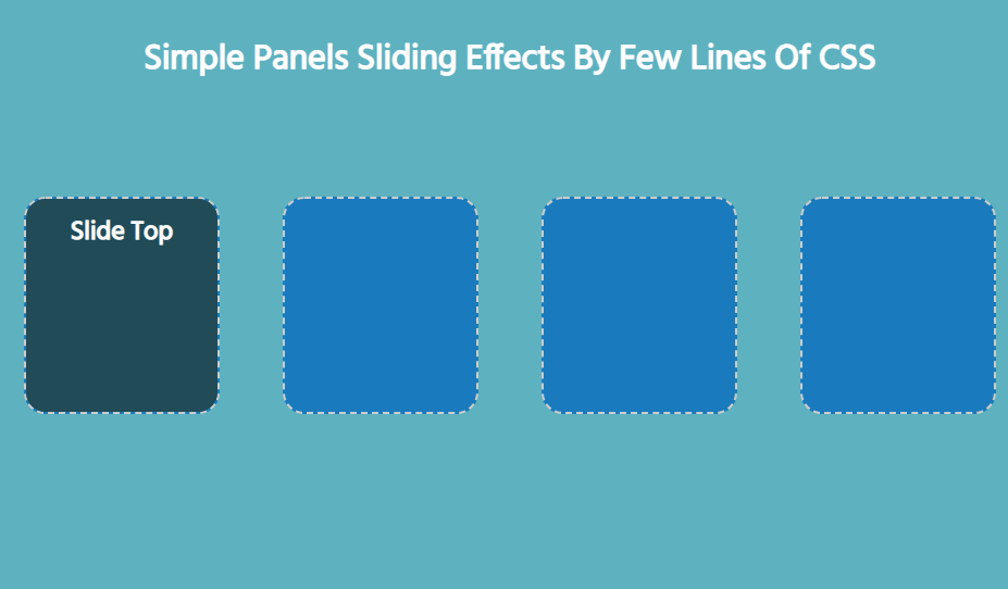
1. Four Panel Timeline CSS Examples
The first one on the examples of panel in css and html takes us to a cool way to showcase a timeline within a single screen. So now you can give the basis for comparison easily. Here images from each year are aligned horizontally with each not hidden under a dark layer initially. Only the year is present as label in the beginning. However its the hover that brings responsive nature. Your hover action results in bringing image to focus, stretching it for a better view and slide the captions for additional information.
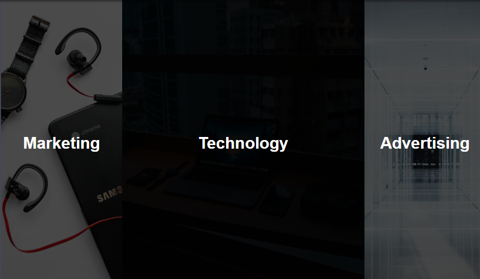
2. Expanding Sections on Hover CSS Examples
Its not only timeline that can be implemented with css sliding panel. When there’s multiple content under similar category yo can feel free to use these examples of css panel. For an example consider multiple types of content that a site offers just as below. An attractive way to offer navigation besides a dropdown menu is the sliding screen. Attractive thumbnail image and expanding effect on hover gives clear idea of current selection before appealing the visitors for a click.
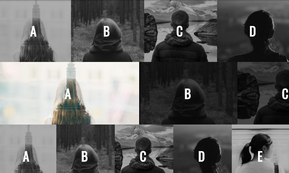
3. Responsive Flexbox Expanding Panels
After a couple of examples of horizontal expandable panel in html and css it might have occurred to you that how a vertical one would look. Well, there’s not much different except for orientation. So, it depends on images that you have on your disposal about which bootstrap css panel you would like to go for.
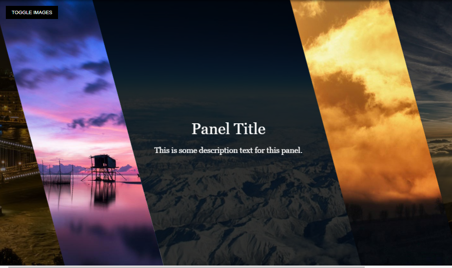
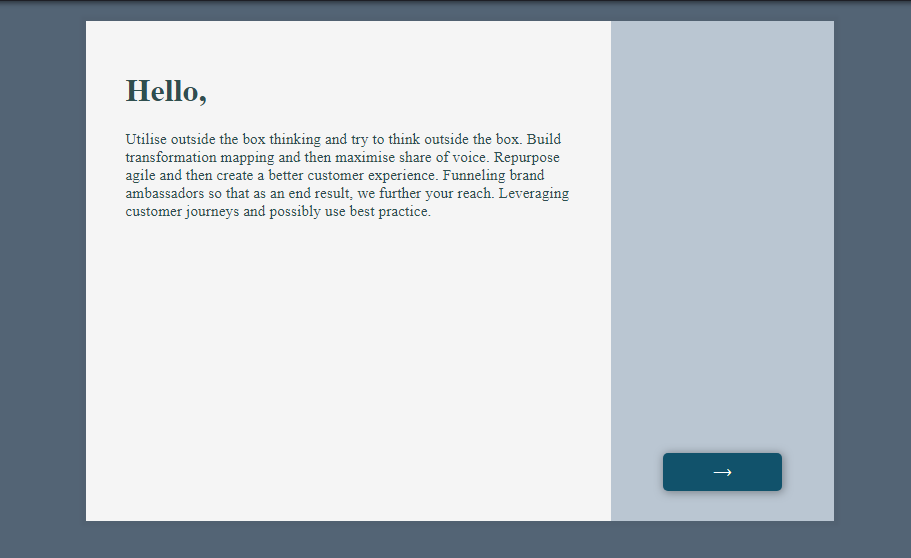
4. Full-Width Panel Expansion, CSS Only Examples
You can use this panel as an alternative to your existing image slider. This is because it comes with a cool navigation effect in terms of hover. Initially you have a all images in a single screen with each of them aligning horizontally. Its when you hover to a any one of the image then you get the image in complete width. Just hover to left or right and that’s it for navigating to next image.

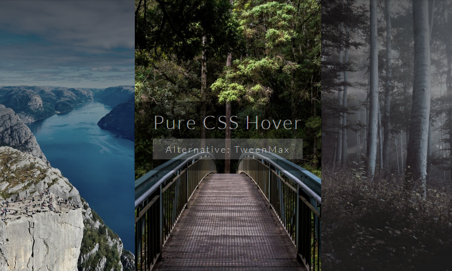
5. Pure CSS Hover Panel Examples
How will tours agency lure you to a holiday destination when you didn’t even had a thought? Its by giving them beautiful layout right after landing to home page. However, its better to give a number of beautiful destination to them and we’re discussing on alternative to image slider. Its very common effect with stretching and color effect on hover.
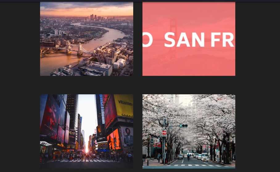
6. Multiple Sliding Panels, CSS-Only Transforms
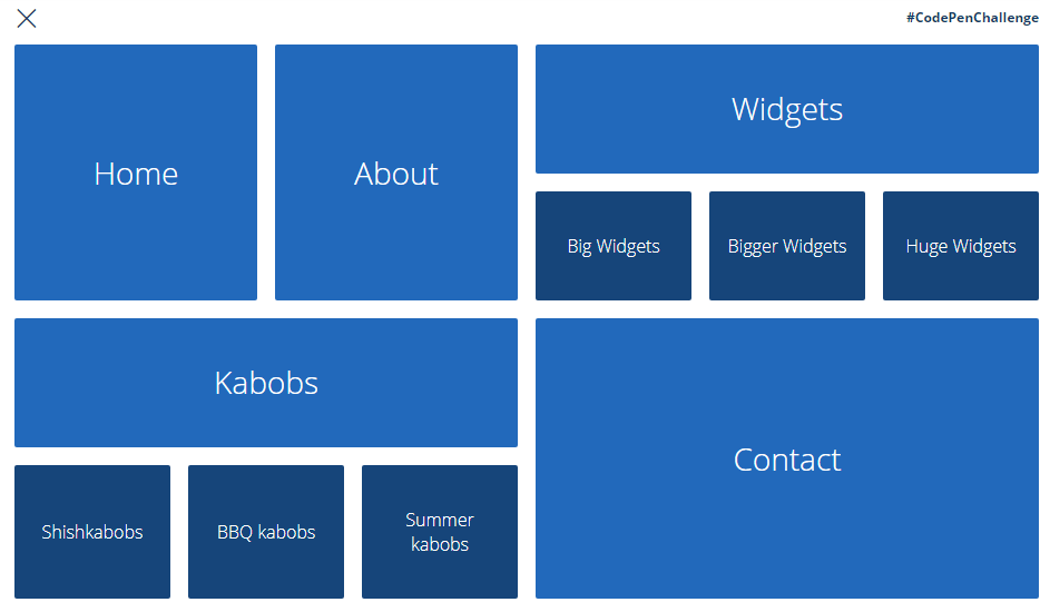
Moving ahead for 3 to 4 panel components here we have css bootstrap panel with grid layout for a collective view. So you can have an entire gallery showcased on a single screen. The image slider will do the trick for only certain number of image however this layout works on large number of images. This is because you can set the size for each each horizontal and vertical layout as per the number of contents you have.
7. CSS-Only Sliding Panels Using Transforms
This example of panel in html and css is slightly different that few other similar examples we have seen by now. This is because in other css examples the selected panel component stretched for better view, that is there is change in aspect ratio. However here the aspect ratio doesn’t change. Just certain portion of hidden image becomes visible by squeezing of adjacent component. So, its like other component makes way for selected component here while the component made its own way in previous examples.

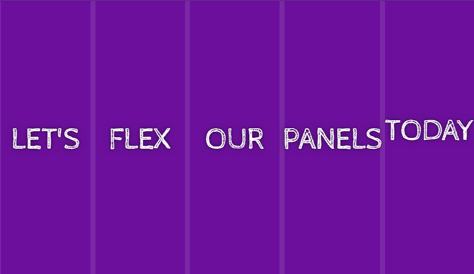
8. Skewed Flexbox Panels
Another alternative of the sliding css panel is inclined sections for each component. This also includes a sudden zoom effect for swift action. You will require contribution from each of html, css and javascript to get such sliding panels. Unlike other examples here we have disabled effect only for selected component. This is done to bring the focus on captions of the image which is seen only after the hover effect.
9. Flex-Panels-CSS-JS
Users have more of the selection control on this css and javascript panel since it doesn’t drive on hover but rather on click. This means that each component expands one click and collapses on another click. Its not that you select another component and the previous one collapses. Animation effect tries to get in line with physical laws. Like we take a few step before trying on a long jump, the component just squeezes a little before expanding. On expanding additional contents slide from both ends of the component.
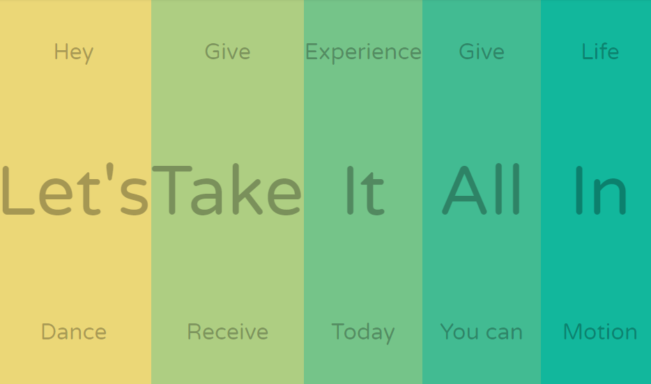
10. Marquee Hover State
Lets for one moment stop expanding and squeezing the images and see if we can do something else with that. Ofcourse there’s many things that we can do. One of them is a marquee effect on images. This means that as you hover on the image some text slides in a continuous pattern. Its like a digital bill board with all information running around all day. These examples of css panel are suitable for news contents or even tourism destination to name a few.
11. Flex Panels
This is a real life example of bootstrap css flex panel that we just discussed few examples ago. All the real life physical laws of gaining inertia before jumping discussed is implemented on the sliding css panel with real website looks. This one particularly looks like a website for some basketball academy or store dealing with similar merchandise. With each component comes a motivational phrase that you may see in the walls of the real academy.

12. Pure CSS Easy Sliding Panel
Hover fast and this sliding panel will give you the impression that same panel slides over each component. This is because the effect is so perfectly synchronized. Except for diagonal slide this pure css sliding panel covers for effect on all four directions. Since its just a prototype you can take it to any path you like and implementation of your preference. The effect is very similar to real life curtains and shutters that hides the content initially but reveals them on hover effect.
13. CSS Grid Menu Panel
The following css bootstrap sliding panel will remind windows user of familiar version of its operating system. Similar layout is still present in latest version of windows 10 but its windows 8 that’s fully based on this layout. So, moving ahead from normal navigation menu, this layout encourages the use menu containers of variable size. You may even include an image slider within such menu layout with plenty of space for more contents.
14. Panel Switch Interaction with Flexbox and JS
We have already seen a number of slider examples for image and now we have a slider for content. These slider contents are just like a series of installation steps while installing a software but in a better layout. So, these interactive panels of sliding nature can be used to express a number of instructions in an step wise manner with just html, css and javascript. Although the navigation option is available, you may choose to automate the content sliding option as per your needs.
15. Flex Panel
Don’t skip this sliding javascript and css panel just because it looks among other panels that we have already seen. Although, majority of the effects are same, we have included each one of them because of some distinct feature each has to offer. This one in particular doesn’t allow overflow. This means in other javascript panels examples, expanding of a single component used to just slide other contents a bit further but not this one. Even though you expand all the components, each will remains in the screen due to the responsive nature.
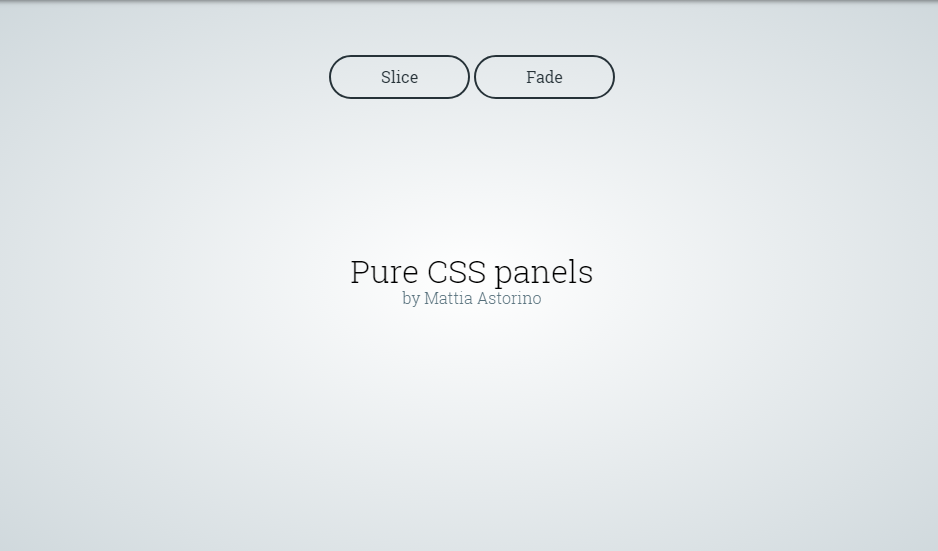
16. Pure CSS Panel
Here we have multiple animation effects for the sliding panel with one being slice effect and other fading. Either way they make a good component for dropdown and pop up content appearance. Simple sliding down still is a popular layout option however if you want to try something else these examples of css panel are to go for.
17. Dual Sliding Panel
This one is like a digital pamphlet. Like a pamphlet consists of multiple pages folded before handing them to other, this one does the same. Its like folding a single piece if paper multiple times to get four different faces. Having middle two faces visible initially we can slide another face from either ends. Give the real physical feeling of folding and unfolding with this example of sliding panel in css, html and javascript.
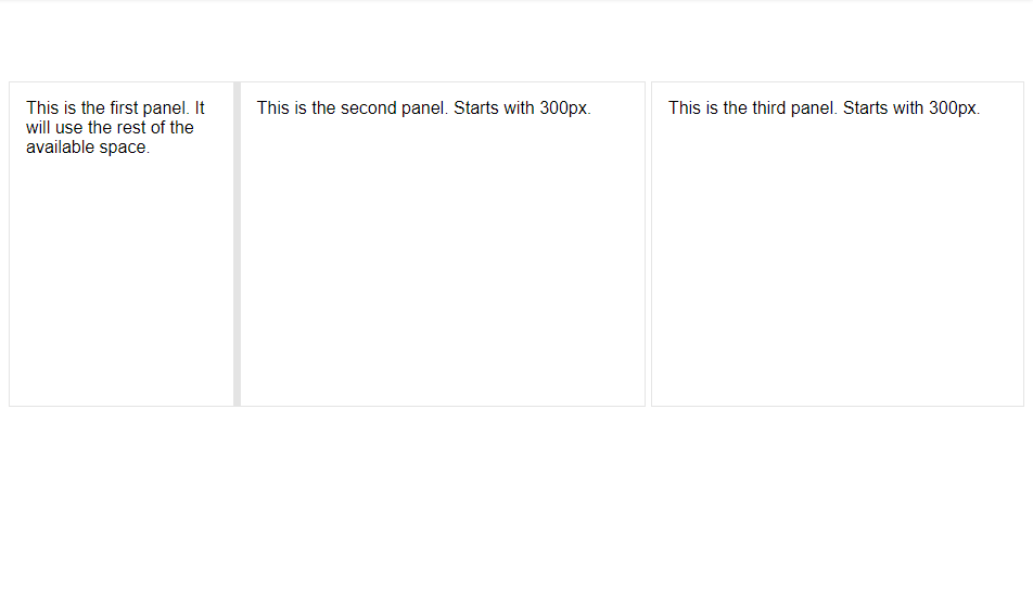
18. React Resizable Panels
These are the javascript panels which allow the users to resize the container as per their preference. In this example you’ll see only change in width since we only have 3 horizontally aligned grid contents. However, with grid contents spread across both horizontally and vertically its also possible to resize them on both dimension. This gives the user full control on the layout that they see.
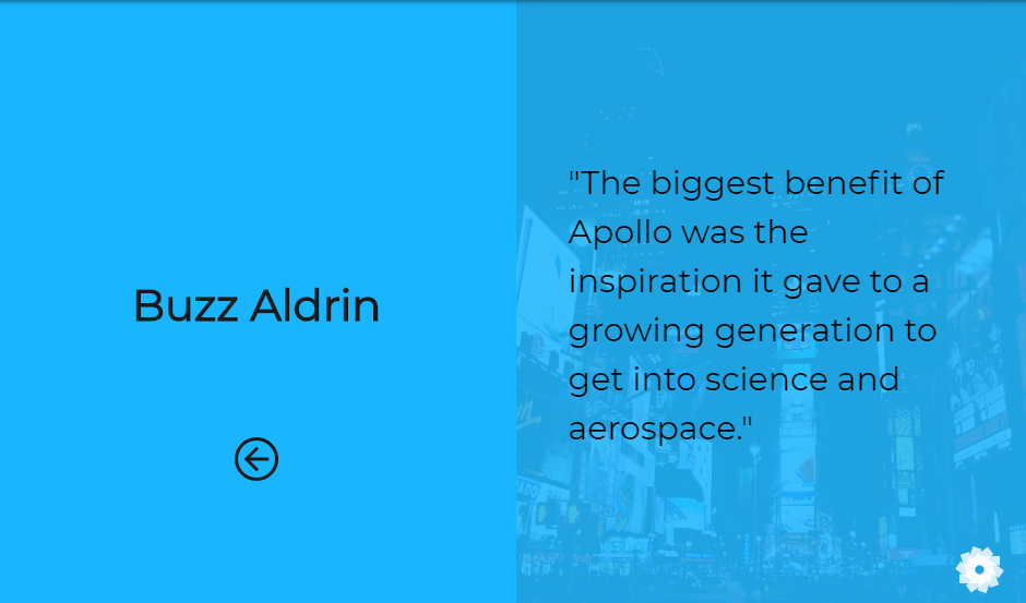
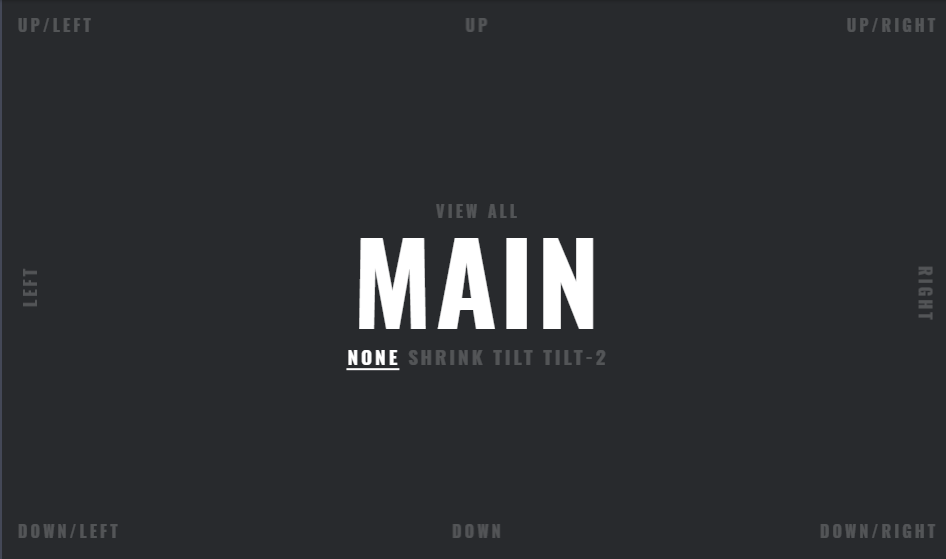
19. Panels
The last one in the examples of sliding panel with css, html and javascript is a full package. There’s so much to explain so keeping it short will be difficult for this css bootstrap panel. So its like a main road from where you can navigate to any direction with each one to offering something. You can even choose to have all view within a single screen. However enjoying the sliding animation is preferable. In this way without any scroll effect you can visit a number of contents within a single screen. As I said it will be difficult to express this bootstrap css panel into words, check the demo and code from link below for more.
Conclusion
Hence these were the few examples on sliding panels with css, html and javascript. We saw a number of demo which gave a beautiful layout to the web with inclusion of the animated panel. They can also serve as alternative to navigation menu, image gallery as well as content management if you’re looking for something new. However we have also covered topics on those web components individually. If you’re looking for more on such contents do check our previous post.