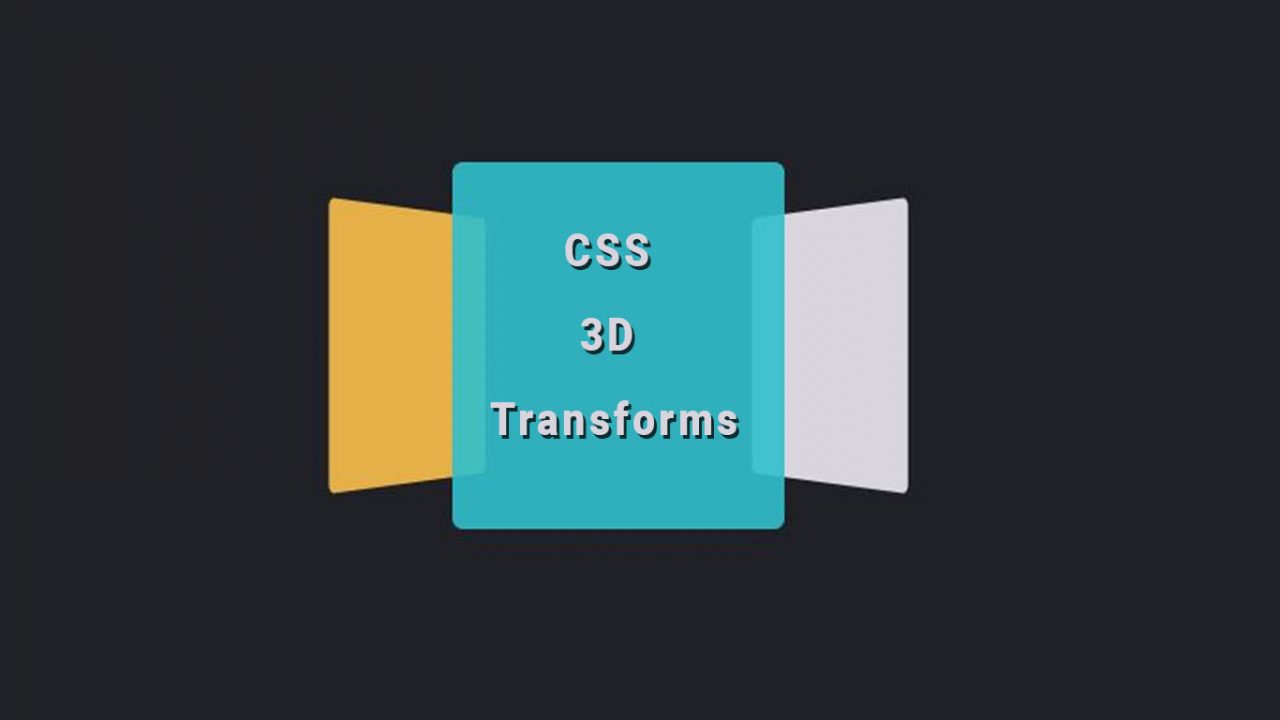
3D is something that has been going around for a while now. Using 3D effect with the help of CSS may be something new to you but 3D transform are more amazing than you realize. It is not always easy to view an image or some other contents from different views and different angles. For this, if there is the presence of 3D view, all of our problems are solved. Yes, this discussion is all about CSS 3D Transforms Example with Code Snippets. Here you will find lots of examples in which css is used to translate normal pictures into 3d. You can either rotate or flip your animation from 2d to 3d with the help of CSS. If you stick with us till the end then you will get all the css translate example in 3d.
So, this is what we are trying to explain that how does this 3D transforms helps us to see an object that may be anything from all the directions. We usually see many items that we can buy online and for that, we see that product from different angles. This is all done using similar process of 3D transform.
Different 3D Transforms Example Code Snippets with CSS
Almost every websites that provides us facility of 360 degrees view uses this kind of process. However, the same process can also be done using various images of the same item and upload them in the web page just to make the user feel the 3D view of an object. It is one of the simple process of displaying an image in 360 degrees view.
Related Post:
CSS Gradient Background Code Snippet
10+ React Collapse Component Examples
15+ Beautiful Toggle Switch with CSS and JavaScript
JavaScript HTML5 Canvas Animated Background
Creative CSS Grid Examples
The alternative solution of displaying the 3D view of an object also include use of many cameras that takes pictures of the object and helps us view it in 3D view. However, here we are talking about transforming an object into 3D model. Here is the list of some examples of CSS 3D Transforms with their codes as well. They are as follows.
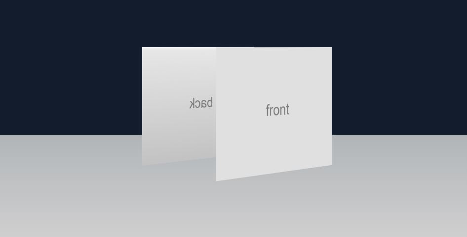
1. CSS 3D – Transforms Example
The world is now moving from 2D to 3D. This is the main reason why you should consider using 3D effects on your websites. The demo below can be a start for you. In the demo below the box moves on its own which reveals the both sides of the box. Although it may seem simple at first you can make the example much better with help of CSS which allows you to transform the box into 3D. In the demo you can see there are two side which shows back and front. You can use this example to make your website have that look you have been waiting for.
2. Image Box with CSS 3D Transforms
Remember those picture boxes that you might have owned back in the day. Well the demo below is the exact box but with added effects of course. Here you can see how the images are still but as soon as you hover your mouse over then the box will split and show the content inside. This is the perfect example that shows how CSS can be used to translate 2D into 3D.
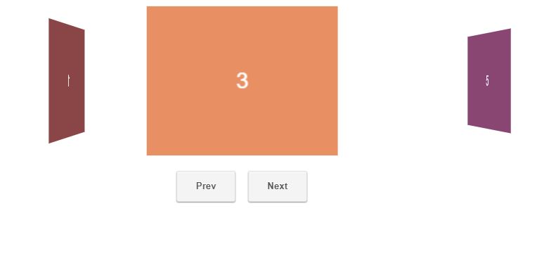
3. CSS3 3D Transforms Experiment
Rotating your contents in a box is perfect way to save time and make amazing animations. In the example you can see how the author has used CSS to make simple content translate in 3d. The 3d image here rotate as soon as you click the next or prev button and this is all possible with the help of CSS and JavaScript. When you rotate the box you will see different content while in the back you can see other box content as well.
4. Interactive CSS 3D Transform
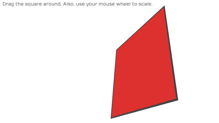
Using CSS and JavaScript will not only provide you simple 3d but will make the images rotate and flip as you want. Here you can see in the example that when you drag your mouse in the board the board will move accordingly. Not only that when you move the board you will get the code of your transformation as well.
5. Clouds using CSS 3D Transforms
Effects which makes simple images move are simply know as 3D effects. If you look at the example here all you can see is some clouds but as soon as you hover your mouse you will see then move. As you use your scroll on your mouse the cloud will go father aways or come closer. You can translate these clouds with the help of CSS from simple 2d to 3d as shown in the example.

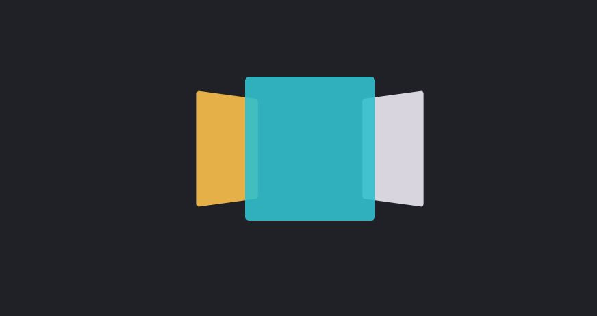
6. CSS 3D transform Colorful Animated Carousel
One of the most emerging topics in web designing is how to make website more attractive than others. This is where 3D matrix come with its css and JavaScript come into. The matrix that is used to in 3d can rotate or flip the screen with the help of CSS and Javascript. As seen in the example below that there are three screens that represents matrix used in 3d. You can see how the screen changes automatically. In the latest update you can even choose whether you want to toggle the animation or not.
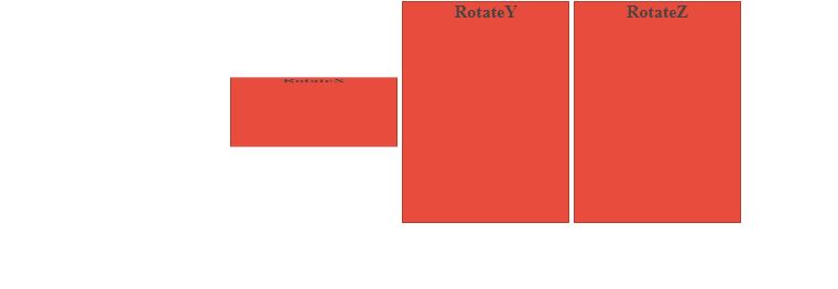
7. Rotate in CSS3 3D Transform
If you have clear idea about what matrix are and how can they be used in 3d transformation with the help of CSS and JavaScript then the picture alone is more than capable to make you understand what is going on here. Here in the demo you can see that there are three boxes which represents rotation of axis. For instance x rotates from up to down whereas z rotates in a circle. These kind of rotations can be much more helpful if you love using JavaScript.
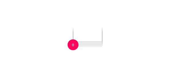
8. CSS-Only Image Stack With Checked
The last example gave us a little knowledge about what matrix are and what they can do to simple 3d with code like css. But now we move to the part where only CSS is used to design some 3d animation. Here you can see that there is a small + button which can be selected to make the content expand. Although this may not look much as this is a little simple but it work in more amazing way than anyone can imagine. You can store lot of content in small even if you have larger contents.
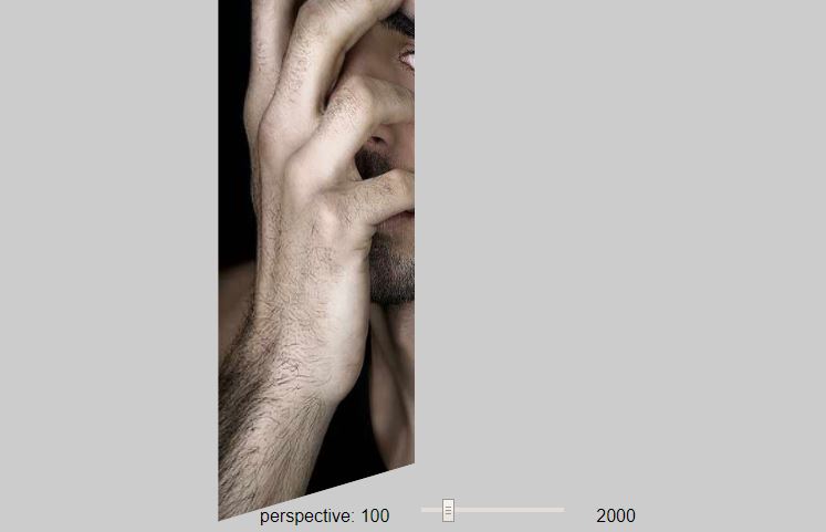
9. CSS 3D Perspective Tool
Are you not so good in coding when it comes to designing or adjusting some content in the web page. Then you have nothing to worry when you use this example. As in this example you can clearly see that when you can adjust the image anyway you want and if you scroll down you will get the JavaScript code for the image. You can flip this 3d image and still still get the codes in javascript and CSS as well. No need to worry about adjusting you images to the right angle.
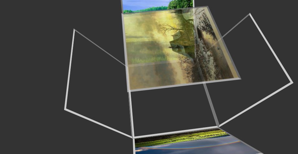
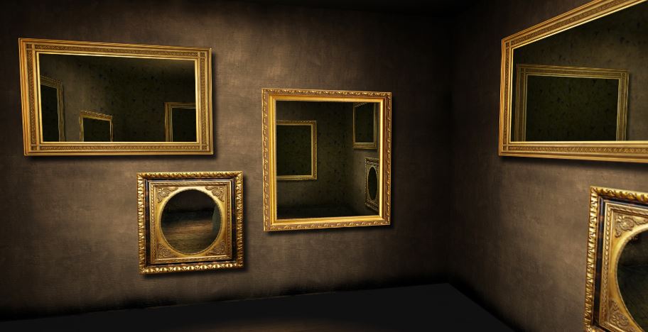
10. Mirror Room CSS 3D Transforms
The world is changing so fast and our technology is changing along side it. So if you want to stay in competition than you should be able to make changes in your website as well. If you are willing to try something new than why not try the demo below. This amazing animation will blow your mind. As you can see in the demo there are bunch of mirrors and all those mirrors which flip and rotate which is all possible due to the concept of matrix and adding of JavaScript as well as CSS in this 3d transform.
11. CSS3 3D Transform that follows the cursor
From social media to the formal rating system all you can find are emoji. There are more than 100 emoji for almost every mood by which people can just use emoji to talk instead of letters. So why not use emoji even in the your webpage. Even better you can use 3D animations to make them more attractive as possible. In the demo below you can see that there are three emotions happy, ok and sad. As you hover your mouse over them those emoji will start to respond.
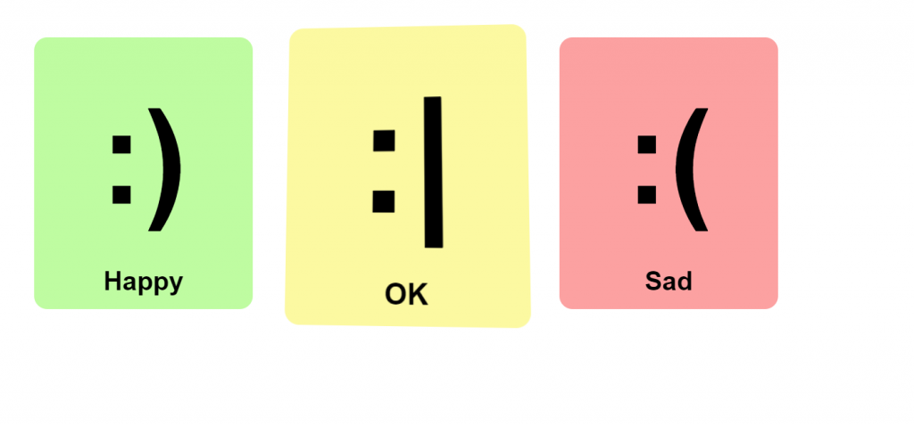
Author: Andrew Burton
Demo/Code
12. Slinky – CSS 3D Transforms
Remember those days when you had nothing compared to kinds like today and you used to play with these in your stairs. Well this example is made just for that. As you can see that there is only one slinky which reacts as soon as you hover the mouse in the screen. I know you may say that where can it be used but if you have broad imagination then you will find the perfect place for this 3D transformation in your website. With little knowledge making something like this is piece of cake.
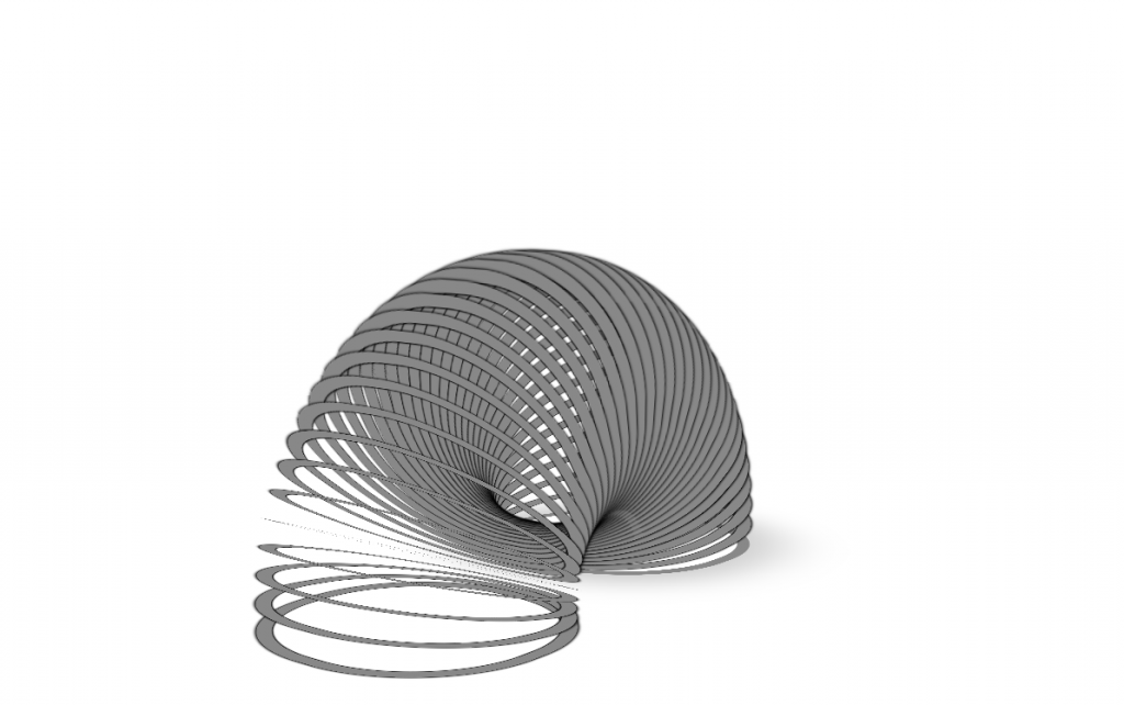
Author: Chris Ruppel
Demo/Code
13. 3D Rotate
Moving towards the last example in our list we can see something quite similar that has already been discussed before so i am not going to give you detail information but i will however tell you what is new. As you can see that there are three boxes with their own unique rotation cycle. Each of these boxes uses CSS to make these cycle happen. This might be the perfect example for you if you are looking something to translate into 3d with CSS of course.
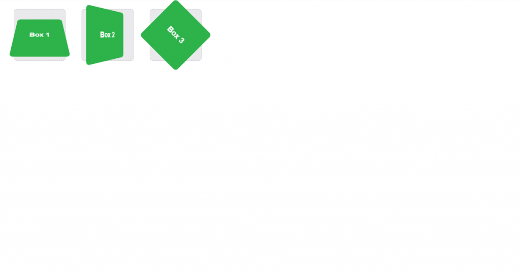
Author: Shay Howe
Demo/Code
Conclusion
Well if you have went through the entire article then you must have clear idea about what 3D transform are and how can they be used with the help of CSS. You must know about how css is used in 3d transformation along side matrix concept to flip and rotate the content. They have a lot of applications. Mainly, we can use them for displaying an item that can be sold online. That is, to help the user see the item or the product from different views, this is very helpful. Moreover, there are other applications of it as well.
Therefore, talking about the 3D transforms, it is very much important to display an object from different views and angles. This helps many people to see an item online just like they are seeing them live. So, this is all about CSS 3D Transforms.