Every stunning website layout has one common thing in between. That’s the use of full screen background image using css and html. With focus entirely in the image, the overview of the contents to be delivered or even entire body of the content can be efficiently delivered thanks to full screen html background. Getting image together for the website design is a trend that never gets to fade away whether that be full screen background requirement for bootstrap or any other framework.
Today’s article serves a number of methods to get a full screen background image. Its beyond just setting the width and height to maximum limit. Other HTML components should align accordingly so that its not just the image we’re getting but a beautiful message delivery along. Things can go horribly wrong when it comes to playing with images in the website. We’ll see the demonstration and code along the way to understand exactly how things are going to work.
12+ Amazing HTML CSS Background Image Full Screen Examples Snippet
The examples of full screen background image using css, html and little bit of javascript is going to be useful for designers and developers for designing layouts of website. Not just any website but those which can deliver so much in the form of images. A photographic portfolio is the main implementation sector however any gallery section of website are welcome to try it out.
Related
- CSS hero image background examples
- HTML CSS multiple background examples
- JavaScript HTML5 canvas animated background
- CSS gradient background code snippet
So let’s get into some outstanding examples of full screen background image using html and css.
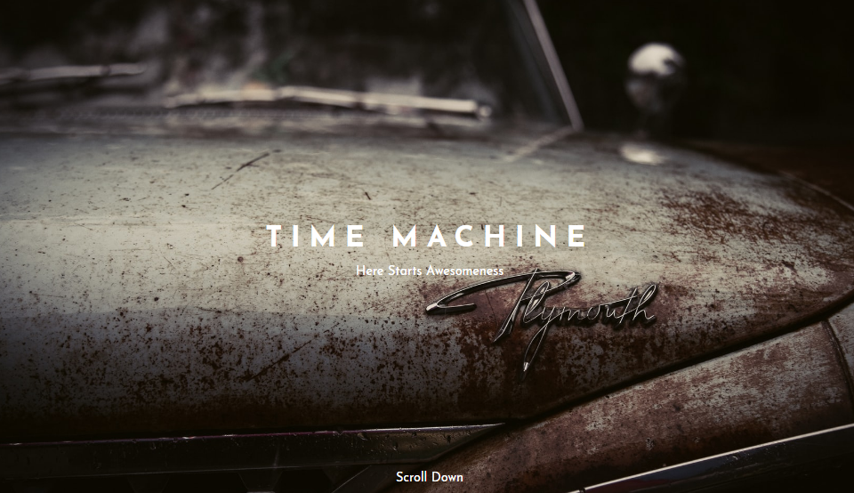
1. Flexbox Full Hero With Button
The pretty view of the evening sky is something mesmerizing and it definitely will make way into a number of website. However, its not just a background image that does the job. The full screen background image also requires proper handling of html components with css. That’s why this example has the styling option for each of the components like header, button, url and a number of more.
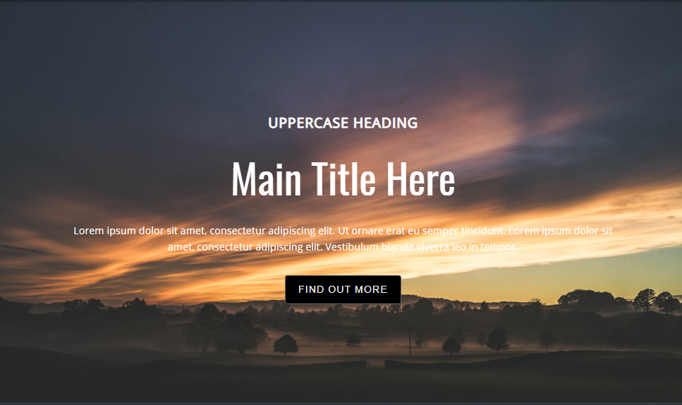
In the layout of full screen background image the body has default css styling option while rest of the html elements have one for their own. This ensures the focus level for each component.
2. Responsive Full Screen Background
Here’s a full screen background idea that fits on any screen size device. It is because of the responsive nature that squeezes and expands the image to best possible view. Not only the background but also the text contents align themselves perfectly according to the screen size.
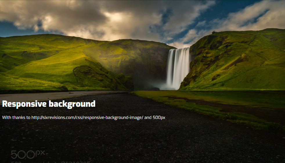
In order to feel the effect for yourself just open the demo link and change the browser size. You’ll see the background image adjusting accordingly. It will take few more contraction of browser size to see effect for the text label but its there adjusting accordingly.
3. Full Screen Background Image VH and VW
Using vh and vw in the css code the following background image is able to get a full screen view port. That’s why rest of the contents appear only after the scrolling effect, However, the contents can be embedded on the image itself. The css property of absolute for necessary divisions allows to achieve that.
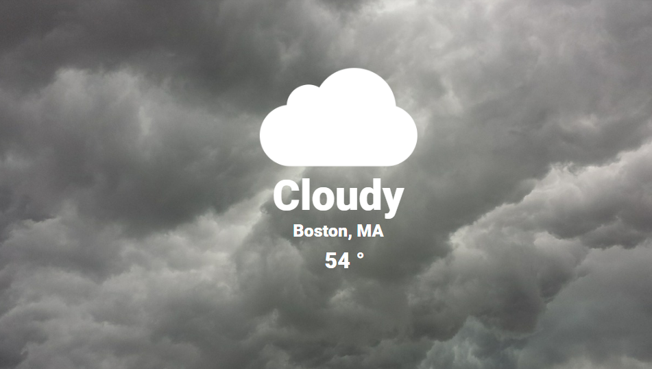
The example we saw here is a clear implementation of a weather content. The rainy background image allows the icons and other weather information to be embedded inside it. This allows the users to quickly overview the content and for interested users they can always scroll down for more.
4. HTML Full Screen Background Image
In the following css and html example we have a full screen background image that is fixed in its position. However, the visitors can scroll down for content navigation. This scrolling action has no effect on the background image.
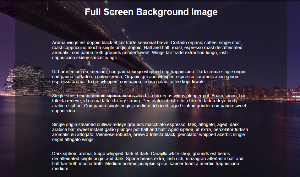
The background image being of full screen and maintaining fixed layout could have affected on visibility of the html contents. However the solution to prevent affecting visibility of both content and background comes from another layer that has high opacity.
5. CSS3 Fullscreen Background Slideshow
Its not just a static layout but an extended version of the image gallery. However its not just swiping of images one after another. We are getting smooth transition of image one after another. The transition comes in the form of zooming for a while and the changing the image.
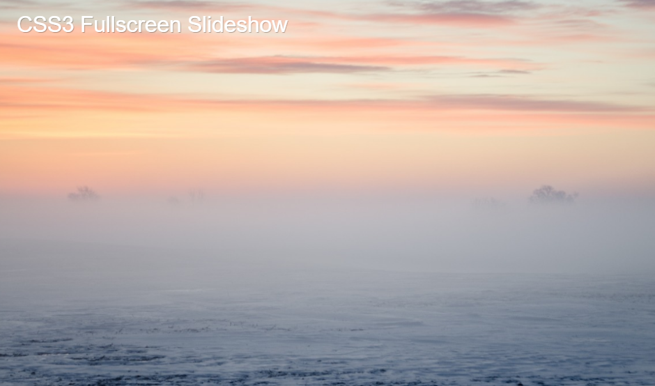
Its not just the image transition we’re getting here. The text animation is also equally important and therefore related text also transforms in somewhat similar fashion. This is not just a full screen background image but a content offering in the form of fullscreen image for the bootstrap projects.
6. Fullscreen HTML and CSS Background Image Slideshow
Here’s a slight alternation to the slideshow example that we just saw. The alternation comes in the form of animation effect. We can see the transition being slow transformation from one image to another without any zooming effect.
Ofcourse the slideshow comes under the direct implementation for gallery section. Being of automated nature with pleasant transition, visitors can enjoy the content you have to offer in a relaxing situation. The trick is very simple for almost every example. That is setting the full height and width for the image component. However, the effect requires additional effort that can be found from the link below.
7. Header For Landing Page with HTML and CSS
Its not a full screen background image as the title suggests but offers something very similar with space allocation for other html body components as well. So what we have here is a diagonal hero image to provide all related header information inside an image.
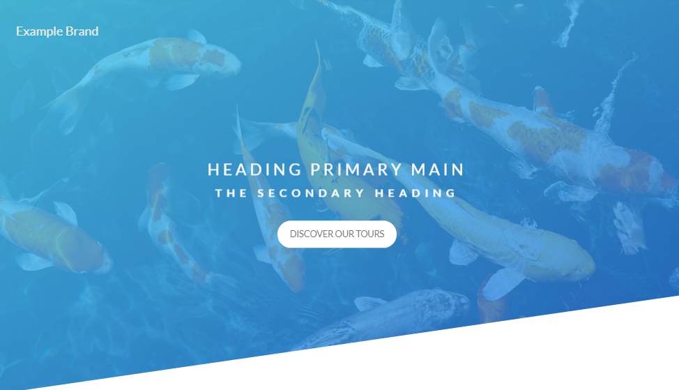
The effect involves using a parallelogram layout to comprise of a header image. You can design a logo and assign it a top spot and provide the title information somewhere in the middle. As a bonus author gave us a button animation for navigation option. Its a 3d effect that lifts up while rendering a shadow for the button.
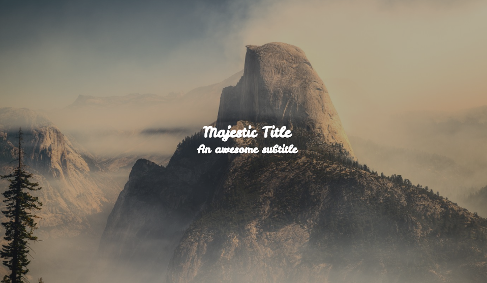
8. Hover Effect for Headers
The full screen background image is not the hero for this example rather its the css animation of the caption. Hence besides the beautiful image selection, designers can consider this layout for increasing user interactivity. Not only for a home page design but it comes handy in efficient galley page as well.
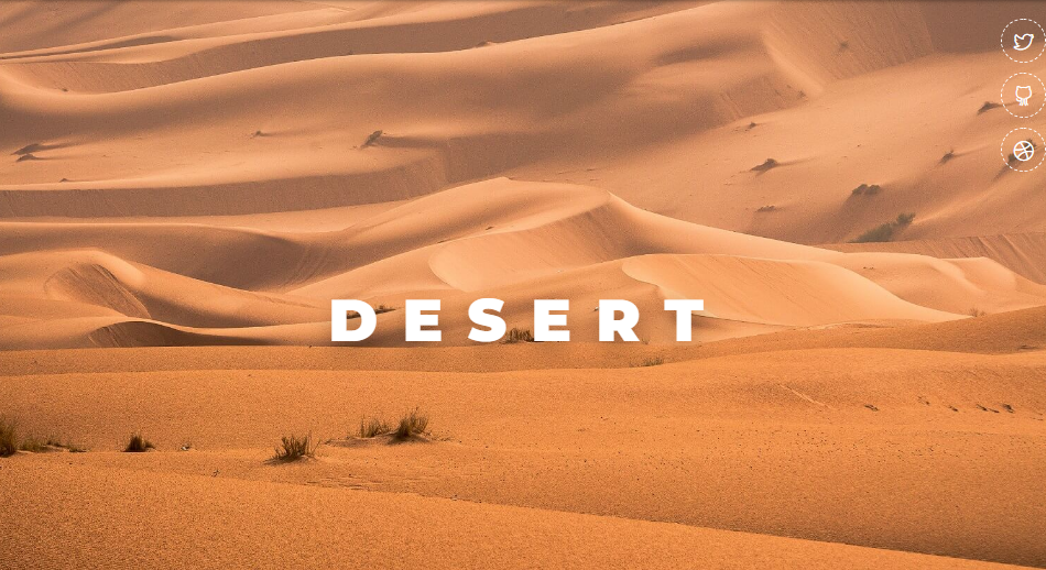
So talking more about the text animation there are a number of those. Firstly its the entire text moving around on hover. However the hover is in the outer layer not the content itself unlike other examples. Other animations involve dealing with individual alphabets in a number of ways. Each image has a text hover effect of its own which you need to see it for yourself.
9. Software Company Header/About
Here we have the implementation of diagonal image holder instead of full screen background in order to bring the html body contents to the view. The image also holds the caption within its area so in a combined form they deliver the message. Just check the example we have here where we have image of having fun while learning and the relevant caption. This describes for the most part of the content that is to offer.
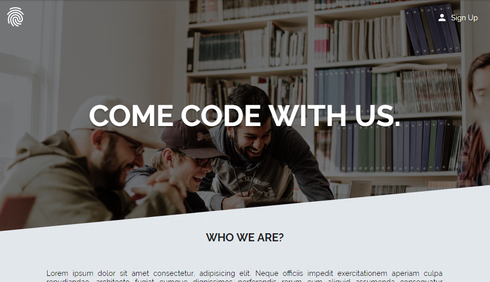
Its a template for software company that the title suggests. However slight alternation and a basic site for any type of organization can be achieved from here. So after that if you are interested then follow the link and test you skills.
10. CSS Only Full Screen Background Image
So what we have here is the full screen background image achieve using css and html only that can be applied to a single page only or on every page. The author describes the way to do is simple change in division type in between body and body landing.
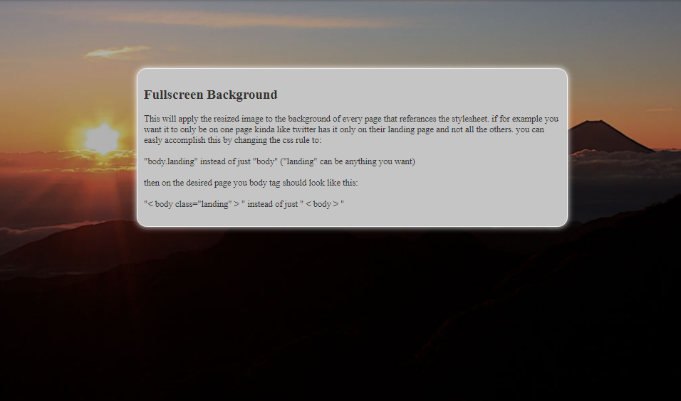
We see the layout we have here gives a entire new layer to the html body content which somewhat effects the full screen background image. Its acceptable for case where content requires each and every attention there is give. However a transparent layer would result to much beautiful layout.
11. Hero Effect–Magazine (CSS and JavaScript)
The principle that this layout follows is a layer of some color on top of the original image. This allows the image to align with other component that might be a plain layout. Hence maintaing the uniformity among the web layout.
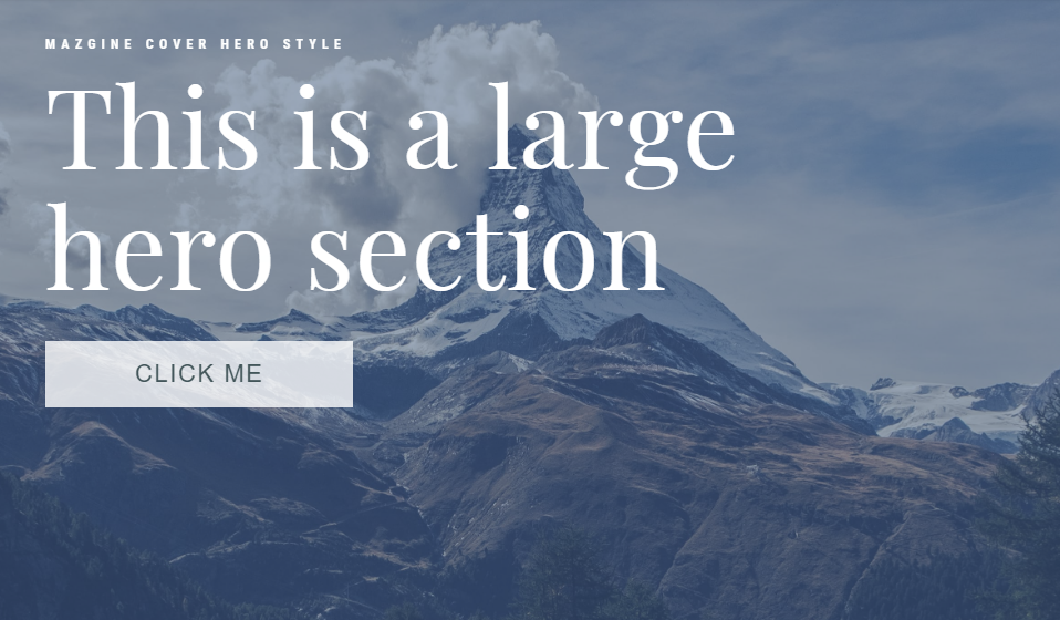
Its not the only effect that grabs the attention. To see what’s more in css and html to offer visitors needs to scroll through the full screen background image that sees its color fading away. It doesn’t only come in the form of html and css only since there’s magic of javascript involved as well.
12. Simple Parallax Header (CSS and JavaScript)
The parallax effect included for this full screen background image layout involves different movement of the image and text label. So starting from the beginning as the visitors scroll the text remains fixed. While image moves slowly upward allowing the below content to show up, they vary in speed. Also the image goes out of focus at some part and the text label gets hidden by the content layer.
This is a great dynamic example while implementing the full screen background image for your bootstrap sit with html body and rest interacting properly. It enhances the user experience to summarize the benefit of having this layout.
13. Hero OnScroll (CSS and JavaScript)
There’s no effect on the scroll for this layout. However, it doesn’t mean its just a static full screen background image for a bootstrap project. It offers a different navigation option in the form of button for scrolling. As you click on the button the image has multiple transition effect. It slowly moves upward while contracting and also fading the image. An entire new content layout appears as after effect.
However the layout lacks the option for backward navigation. We leave that to you giving the source code for the layout from the link below.
14. GCSS Background Size
For the final example on the full screen background image we have a fully customizable layout to select the best one for your bootstrap project. This involves setting different image size with style and a number of positioning.
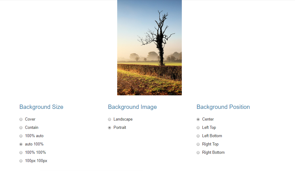
With more than 50 combinations to try it almost guaranteed to get the layout that your website deserves. It doesn’t have to be a full screen image for the best result. This is because website layout is the combination of a number of components. As we have seen image and text are going hand on hand to give an amazing layout. Therefore, the example that we have here allows you to test the image layout with consideration of other factors that are equally useful.
Conclusion
To sum up the things the full screen background image lets no room for empty white fields which is an amazing layout to be achieved for every website design. The sole purpose is to immediately captivate the visitors of your site. A beautiful layout to set the path for your visitors into your website.