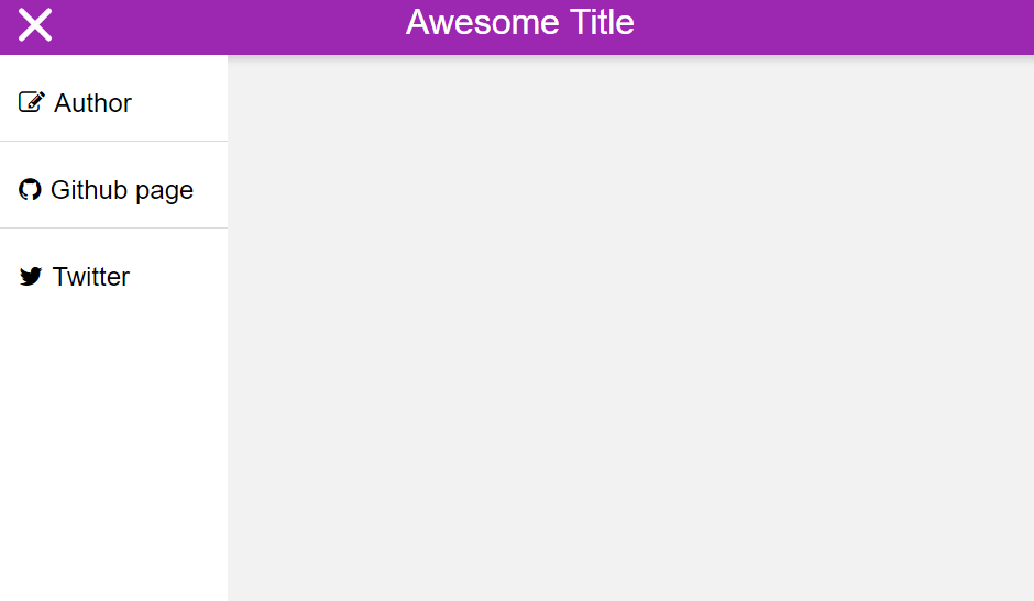
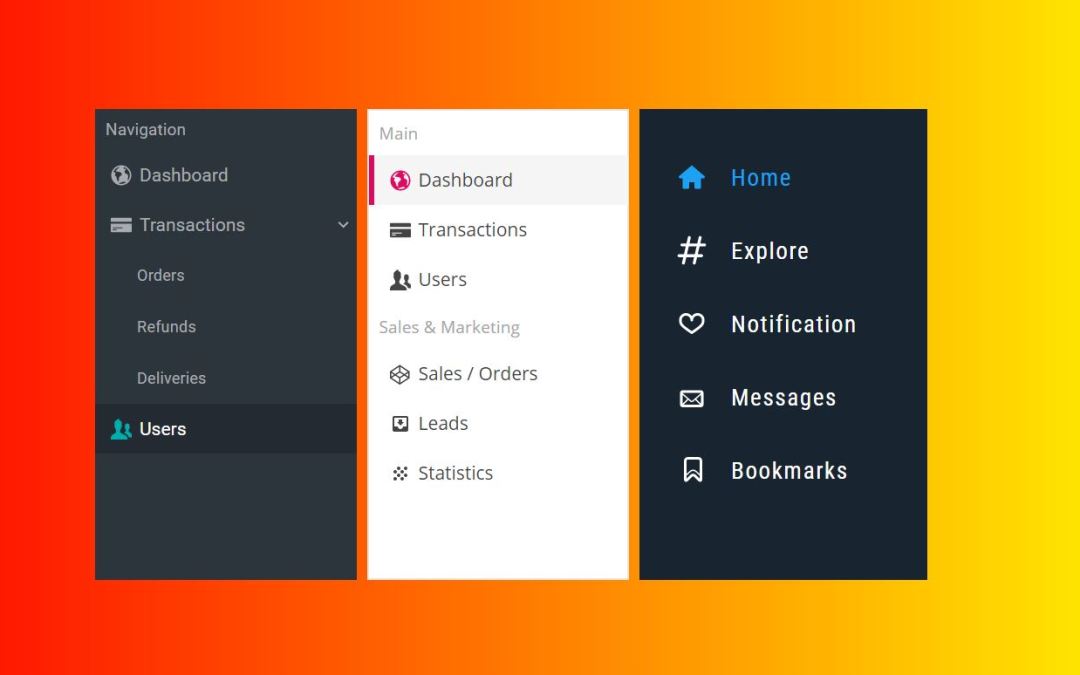
There are many website and application front end components to consider. Ask people to name few and menu will come with first few picks. This is because people may or may not prefer on next level animations however they want a good navigation option with the menu. Its like going to an unknown place without map or any reference if there’s no menu. From user experience point of view to good SEO score you need to define good react menu component for betterment of your website. React sidebar menu along with dropdown navbar is one of the menu available. Mostly these react native side menu comes in handy in mobile applications along with toggle action so that you can save some valuable screen size. However these menu are also getting popular among websites and web applications these days.
Vertical navigation or simply a sidebar menu can be tricky that needs some consideration. While a horizontal menu got no issues with dropdown menu, it becomes a concern here. This is because all the menu components align in same axis that is vertical. However, some simple tricks here and there and you can get absolutely fantastic results. We are here to discuss on same with some examples to prove the point.
Amazing Sidebar Navigation Menu Component For React
In this collection I have brought some of my favorite sidebar menu for a great navigation experience. Some of them may be ready to go along with customization as per your need while some may be just practice examples to take inspiration from. Nevertheless, the examples we have today will be useful for your next or current layout design.
Related
- Awesome circle menu examples
- Sidebar css menu examples
- Best react material UI components and libraries
- CSS mobile menu examples
- React color picker component libraries
Without any further ado let’s dive into 10+ examples on react sidebar menu component as follows.
1. React Side Nav Component
Sidebar or horizontal react menu? Why not both? Well if you have a lot of screen space to offer you can include both but simply one will efficiently do its job. However, one idea that struck from this implementation is that you can include main menu as either other navigation option; I would prefer sidebar though while offering another for navigation of its child. It will be a unique way to display the content as a combination of native side menu and react tab component replacing the dropdown idea.

In addition there are two layout styles to choose from. Either color the entire sidebar menu with same background or alternatively fill the navbar react icons with other color. Almost forgot a important feature that is toggle action. If you feel native icons are not sufficient for your side menu simply offer an extended version by the action.
2. React Metismenu
Metismenu is a sidebar menu built on react with dropdown feature to show child menu. Moreover, the indicators show if any menu component are expandable or not. This ensures that users don’t miss on any of your offerings. The expanding of menu to expose its child menu has the stretching effect on components below so that it looks as if the entire layout is made of rubber.

Look at the code below and if you feel like including it for your project feel free to do so. It is because the react menu component is ready to use, animated along with support for AJAX and customizable to your needs.
3. React Sidebar
Do you like multiple scrollbars for your application? Its a good idea to let main content and sidebar menu to be treated differently. I meant if the react sidebar menu is a bit long that requires scrolling to be completely visible why should its navigation effect content and vice versa. It’s cool if you didn’t like the idea because just uncheck in a box and you’re back again with native layout.

Thanks to the touch support you can use the same react menu component for your mobile application. Choose to make it sticky, appear on toggle or let itself decide on when to appear considering surrounding media; all of these come under a package of below 2.5 KB.
4. React burger menu
Burger is one of the favorite food for the foodies and one of the most used button for designers. After seeing a hamburger icon anyone can tell there’s more to offer than what is being shown. This is because most of the time this icon is used for toggle action in order to show off-canvas menu.

While sliding done a hidden side menu is the basic concept; what additional react effects you offer is the thing. With the following react sidebar menu you have the option to include 10 types of rendering effects. These effects include normal slide in to stacking components one above the another or apply some rotating effects on both menu and content. More details from the link below.
5. Off-canvas menus for React
This is one of the react sidebar menu that you’ll target to achieve during early learning days. By no means its a menu ready to be part of any application however its a base on top of which you can provide your own touch of creativity.

The effect is fairly simple. Its the content layer and the menu layer that are attached with only content being visible at the beginning. As you apply the toggle action the menu layer wishes to greet you and appears by shifting the content out of sight.
6. Side Navigation Component for React
A number of react based navbar menu component for your application as per your need. The varieties of your need that this react menu component will fulfill are nested menu navigation, title based menu categorization or a cool css layout.

If you’re thinking to use this set of react sidebar menu component the you’ll need bundler to do so since they are exported as es module. Furthermore, if you require this menu for Typescript project you’re welcome to do so.
7. React motion drawer
There has been some debate regarding whether should the application close the slide in only with a close button or with click on anywhere else. It varies from user to user. While closing from touch anywhere outside makes it easy for users but close button reduces the mistake of accidental closing. So, understanding your users or discussing with the stakeholders you won’t have to think of multiple designs. This is because any of the feature selection or disabling is just a click away.

Furthermore, the background brightness changes as a result of sidebar sliding in or going back. Therefore, you can indirectly indicate the users regarding disabling or enabling of contents with this simple trick.
8. React Slide In Menu
Sliding menu and the content layer have quite a complicated relationship in between. They need to be in some agreement while sliding in and sliding out the sidebar. However, in the argument between react sidebar menu and the content why should header suffer? Therefore, with the following example of react side navbar menu let the header content be unaffected. Since header contains aspects such as company logo its highly recommended to make it stay as it is.

There’s nothing new to talk about just a simple sliding effect of react native side menu useful for any basic website. You may include things which if included give better results however if absent doesn’t cause too much of issue.
9. React Hamburger Menu Example
I think we talked too much on react native side menu so let’s shift our focus on dropdown menu. You may think side bar menu maybe only solution for mobile application however that’s not the case. Its kind of a fact that you can’t afford a sticky menu for mobile devices so off-canvas menu is the solution. For those who want to go for more unique selection of menu for mobile, this react dropdown menu can be a good choice.

Selection of native side menu maybe as a result of letting content have some focus despite providing navigation option. However, the react dropdown menu such as this sets the entire priority to navigation option. Therefore depending upon the focus you want to give on menu and content wisely select the transition style.
10. Menu Animation – React
Rendering the components in a web layout is an art while use of multiple animations is Picasso of it. Sliding in the react native side menu is a basic transition to start with. There are still component inside the react navbar menu which can offer extra set of animation. We’re talking about the same here.

The animation we have here is the menu components becoming visible while moving to their stable position. It also gives asynchronous loading effect due to the layout.
11. React based sliding menu
You may have the feeling that few of the transition effect were swift. Some may like it while some may not prefer. If you want to offer a smooth transition effect for pleasant experience of the users.

I must tell you the react sidebar menu we have below doesn’t really offer good set of components. The menu components are also not properly aligned that looks like a bunch of icons compressed and placed there. However, its the smooth sliding effect that you may consider getting from this menu.
12. React Sidemenu
The following example is lightweight react menu component that’s built on react with pure CSS. With that there’s no any external dependency associated while being configurable with JSON or other react components. Its is packed as ready to use component however if you wish for any custom styling, you can get the styling guides for easy start.

So, talking about the main features of this react sidebar menu it supports component arrangement on the basis of some category. For example some actions under human resource while separate set of actions coming under sales. Enable or disable collapse function as per user desire and set proper navigation tracking system bu some unique styling to active components. More of the custom style coming from the link below.
13. React push menu
This push menu won’t push away your users but just pushes the side menu to offer easy navigation. Nested menu can be some what complicated. You need to make rest of the menu components align according to different number of child menu. So, a simple solution may be present the entire set of child menu overlapping the previous layout such as example below. With simple back navigation option it won’t be much of issue if user enters the wrong component as well.

The layout is common implementation for mobile applications however using it in a website is also suitable. Covering and overlapping of the react navbar menu is something to consider even for a menu of different initial appearance.
Conclusion
That’s all for the react sidebar menu today but one thing’s for sure its not the end of menu series. Menu is a basic component for web applications and each one serves a different purpose. Only one thing is constant and that is change. Therefore, keeping in mind that there will be more types of menu options to come we promise to be back to cover them for you.

