Button is one of the common user interface layout which is also the gateway to some system features. With that being said button requires to be visually attractive and informative on its own. E-commerce and other similar sites take extra care of buy buttons or join buttons because it helps to boost the sales and gain users. Influencing the users mood and playing with the psychological factors is the key. Use of gradient colors is one of the way to influence the mood. In this article we will see a number of examples of bootstrap button with css gradient background along with code for your website.
The main features to consider for creating a button involves making them appear and function like a button. You can associate a click action to any component even a normal text however by looks itself user should be aware some click function is associated. Additional animation effects which give a feeling of applying touch or pressure is preferred for buttons. Also make sure to consider size, position and labels for the best results. I don’t need to mention navigation to correct action because I don’t think anyone would pefer messing with the user experience.
Collection of 20+ Awesome CSS Gradient Button Examples with Source Code
Depending upon the type of service that your site or application offers, you can get a number of designs and colors for buttons. Test your luck if any of the buttons we have below exactly matches your needs. Alternatively, you can atleast get the inspiration for designing a creative and unique button of your own. Nevertheless, we assure you the examples that we have here is worth of your time.
Related
- CSS Buttons Hover Effects Examples
- Social Buttons For Bootstrap
- CSS Animated Button Code
- Text Glow Animation Effects CSS
- CSS Gradient Code Generators
Dive in to the amazing examples of gradient buttons that we have for you today as below.
1. Gradient button shadows
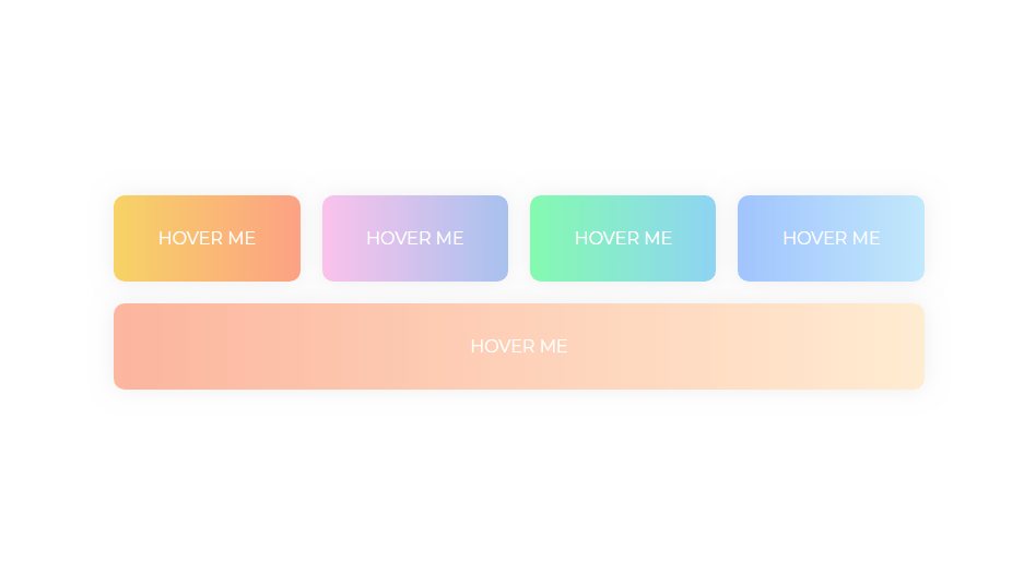
After going through some 3D effects for menu and text, its time for offering something similar for buttons. Since buttons are gateway to some functionality in the application it should we visually good. Not only that users should get some idea about the button without having to go much in details. Using gradient css color for website button is among the examples for the solution. Like green will indicate something relevant to addition while red color for delete action.

2. Gradient CSS Button with Background-Color Change Examples
Its always good idea to give dynamic effects on button or any user interface components. This makes the layout more reactive to user actions. Interactive design is the key to beautiful layout along with better user experience. With that on mind the following buttons offer something similar. As you hover the gradient colored button, it changes the background just slightly to give a shiny css effect. It looks as if your touch was the sunshine for the button. So, get the shining for your button from the code below.

3. Gradient buttons
External link is one of the important aspect to consider for a good SEO score. Most of the website do with the link to their social media sites. Its a good approach however it requires to be done properly. Use of exact social media icons is one of the method to do so. Whether that be in around layout or a square, I leave the decision to your preference but following are some css gradient button examples to include social media link in your website. Along with the background color matching the social media theme we get a cool shadow effect on hover which makes it icing on the cake.

4. Gradient Button Animations CSS Examples
There are always a number of button options available in website or application. Making them distinctly informative is one thing and enabling selection effect is the other. Users should be aware that they are currently selecting one of the button and click to it can be of some consequences. A sudden change in background may do the work but may not be visually attractive. For this we have the following button which changes the gradient colors on hover to make it darker as if its under pressure for your website along with code.

5. Gradient Button
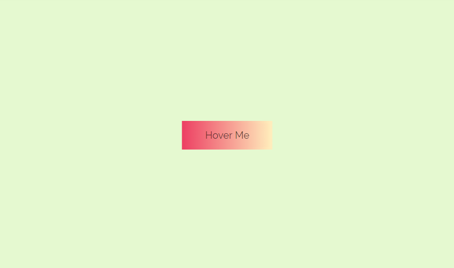
You can achieve a number of gradient effect for button selection indication. This one is similar to previous examples of gradient button with just different css colors. The animation includes just the color change within button’s border. More than color change it seems as the background shifted just a little to indicate the user action. You can also choose to add similar effect for background of your website however the code for this button is enough to do the work.

6. CSS Gradient Button
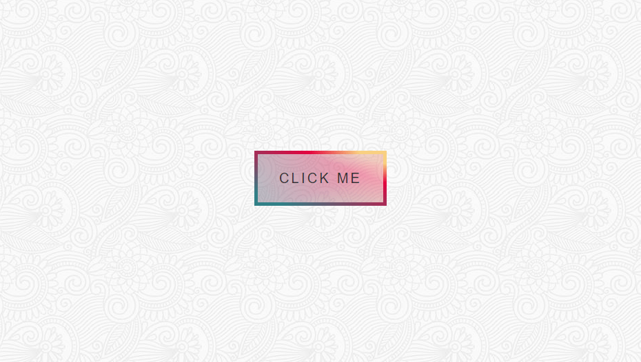
Selection indicator is a good effect however you shouldn’t always rely on user action to show the effect. There are a number of examples that require gradient color change with css for button or any label. Cases such as promoting combo sales, discount offers in a website requires user attention before even they know its there. You can add that effect by such example where the color changes periodically to grab attention. Moreover, with color change happening only in the border it won’t be any complicated effect rather a pleasant one.

7. CSS Gradient Button Examples
If the gradient change in color is not the type of effect that you were looking for then we have another example to offer. This one doesn’t change the color but changes position. This means as you hover the buttons, they slowly move to either of direction with shadow showing up in respective direction. Therefore its not just changing the current position but changing it with respect to a fixed light source.

8. Gradient Button Hover
So, its the examples of css gradient button with shinny effect that you prefer? However, you’re not sure which color to go for. Don’t worry we got you covered. Below we have a number of primary gradient colors with shinny effect on hover. On the basis of your website theme you can get the code for button from the link below.

9. Cat Gradient Button Disco
With one line of code you can get lightweight and customizable button for your website. This one’s for party lovers by the way. We saw gradient button that changes color automatically on its border. If we’re looking for more attention then this one might be it. Don’t start dancing but its disco effect with a range of colors changing automatically just like a real disco. Now you can start the party on your website.

10. Animated Gradient Buttons
You might be feeling we are so biased to offer only shiny gradient effect for bootstrap button. We’re just halfway so don’t worry by the end you’ll get to know a number of background gradient effect with css. In this particular example we will offer three types of shiny effects. The first one is shift of background that you have seen before. Now next examples are new to the list. We have an effect where gradient background seems to spin while another one sweeps a background through the css button.

11. 3D Gradient Buttons
Another way to indicate the current selection which I think is most eye catching is 3D effect. This 3D effect is achieved by slightly shifting the button from current x and y axis while showing shadow effect along z axis. In addition to that the gradient css color change that we have seen till now adds extra dynamics to the design. You can either choose a plain background to change into gradient css color or vice versa.

12. Animated gradient button [pure css]
The speed of gradient color change is key. Fast movement like a disco theme indicates the users to just go with the flow while a smooth transition of gradient colors can be a pleasant feeling. Either way you can grab attention of the viewers towards something you want them to see.

13. Gradient buttons
It might be the case that you want your users to turn their focus towards left or right direction as they select some button. So let the buttons speak for themselves with effect to slide to any direction of your preference. These are the examples of pure css gradient effect for button which helps you to achieve such effect.

14. Outline gradient button
The gradient color that appears in the border of the button are like tap that’s holding the colors. You open the tap by a simple hover. This causes the button’s background to fill with css gradient colors to add an effect for your web layout. Moreover its one of the pleasant and effective means to indicate users about their current selection of buttons.

15. One div hover animation
In this example of bootstrap gradient button we have absolutely nothing in the beginning. Just a hover over me instruction so that user don;t run away without even checking. Its pure magic of css when you hover over the instruction. A square with curve edges appear with some shadows. Its like a race of gradient colors on the border very similar to high speed motor race where you see only the lights. This animation is not only suitable as active indicator but also can be used as loading component.

16. CSS gradient button, hovers smoothly!
Is your business related to something tradition? Or do you want to give some south Asian touch to your website? If yes, following gradient button is the example to go for. While previously you may have been overwhelmed by the rich css gradient button color, this one offers much balance. Due to transparent button in the beginning users can enjoy the background while hover on the button an the focus shifts to the button.

17. CSS gradient button
Its always a good idea to illustrate touch effect for any button. Touch support devices often involves wave effect like touching a water while for non touch support it can be like pressing the keyboard. You get the similar effect with following example. It is obtained by change in background gradient color of bootstrap button. Its kind of blinking effect where upper layer turns into white as long as you press the button. Therefore, if you like this website button you can implement the code available from below.

18. Cool Effect Gradient Button
Buttons are waiting for touch from users. Its the user interaction that completes them. So, let’s visually express that with bootstrap gradient button that fills with color like a progress bar. In other words, the initial button looks like a normal design with gradient colored border and plain background. As you hover to the button the inside of the bootstrap button fills with gradient colors not at once but in a sequence of steps visible to eyes.

19. Cool Gradient Button
I will give a real life example to explain this bootstrap gradient button. Have you ever tried focusing sunlight on face of your friend using mirror or watch for reflection? Would you like the same effect for your application? You just need to use simple code to achieve this website button from the link below. Simply reversing the current gradient colors position is good enough is give such impression. So, no need to tilt the button to achieve the effect just check the code for learning more.

20. Gradient Buttons CSS
We have saved the premium button for last on the list of css gradient examples. From pure css and html code you web different button of 3 styles, 8 colors, infinite color picker that easily integrates to your website. Being an premium option they are not free to use. So if are not sparing any expenses for your website you can always go for premium options while some free button may also do the work for you.

Conclusion
With the aim to take users to the desired functionality, buttons should be smooth as a butter. Smooth in the sense that they shouldn’t be hard to find nor confuse users regarding what they offer. They should be crystal clear and hold attention grabbing capability. The same might be the difference between the users who just navigate around your site or get converted into clients.
