Just with html and css we can get amazing table layout examples that are responsive in nature and functional as well. Heavy programming concept and logic don’t even needs to be involved to get dynamic tables. We know how important tables are for data visualization. They give a summarized information and archiving the required data is not a big deal. Moreover the components of html and css allows developers and designers to be free from screen size. You can easily maintain the fixed aspect ratio for the css table layout that aligns with any device. In addition, influence your viewers with attractive border color for the bootstrap data table with css which we will be illustrating further below.
It is not a hard written law that you need to use table in your web layout however using one comes with multiple benefits. When there’s a number of data there comes the need of efficient management and layout. We even use database in tabular structure since its most efficient way to do so. From differentiating between two topics to preparing a work schedule most of the data relevant task involves tabular layout. That’s just about the paper work, you can much more on digital screen to make things easy.
20+ Different Responsive Table CSS Examples Code Snippet
Major implementation of tables in website and web applications involve offering multiple price and plans on product besides visualization of normal data list. Here we have a number of templates to assist you on same implementation. Color, appearance, interactive nature and other designs were under focus while coming with these examples of table. However you can still offer your own customization and edit to get the most accurate layout for project.
Related
- Data table libraries for react
- Interesting pricing table UI design
- JavaScript alert box code snippet
- Gradient button examples with css
- Free react admin templates
Check out the examples on mobile friendly table designs along with code and cool hover effects below.
1. Table Responsive
We dealt with these sets of hover effects on a number button examples. Well since there’s so little to distinguish between a normal styled button and a cell of table, its not a bad idea to apply a number of button effects here. So following the same trend we have a responsive bootstrap table with css effect on hover. As you hover on each cell except for the header it seems as if the block is attracted by hover magnet. So, while trying to come out from the cell it also changes color from a complete dark layout to bright yellow.

2. Responsive Table HTML and CSS Only
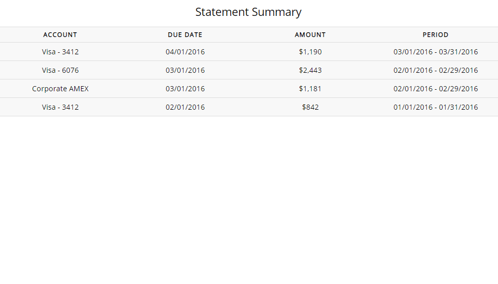
This example of css table doesn’t offer much fancy effects but still provides a responsive feature. Sometimes that’s all you need. So being responsive the css table layout fits accordingly to different fixed screen sizes. Its layout is very similar to excel sheet so it may need no introduction. Therefore you need need to copy excel sheet and paste on your website editor. You can directly work on the website itself.

3. Simple Responsive Table in CSS
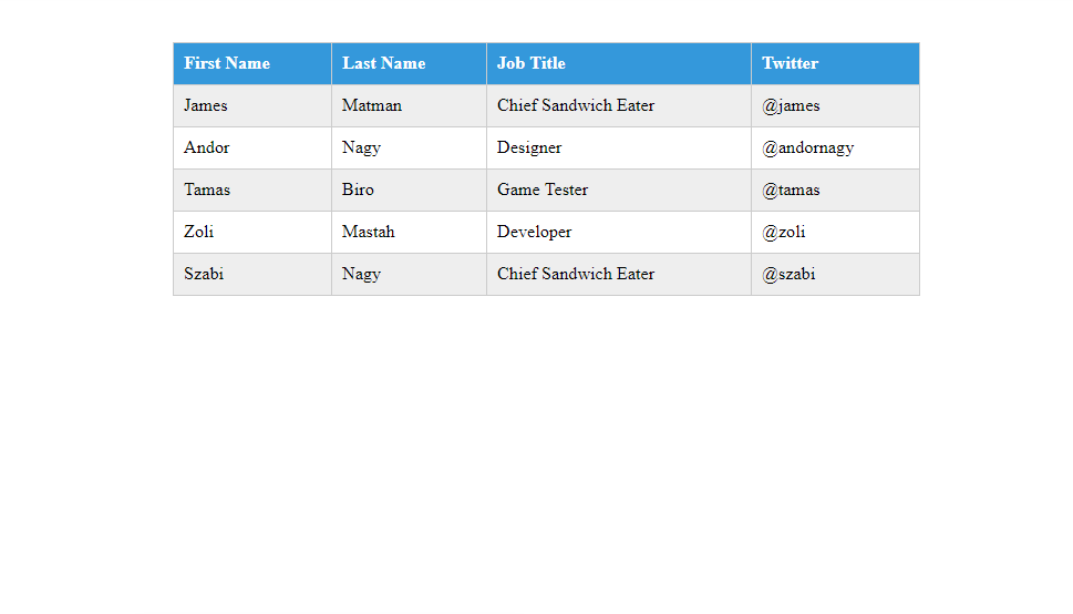
This is one of the examples on table layout that focuses on responsive feature more than attractive css layout. You can choose the layout as per your organization’s theme because for users its just the matter of how efficiently they can view it. If you ask my opinion I like the mobile layout more than the web one. For a small screen mobile device the table breaks down into a number of tables to give the best possible view. This is what you call a proper responsive table achievement from bootstrap css.

4. Pure CSS Responsive Table
Combine the last two examples of css table and we get result as follows. This means the excel like layout and responsive nature. Responsive nature is same as just discussed with table breaking into a number of tables for small screen device. While doing so each table gets the main header transformed into their first column. So, its becomes a layout similar to information on filled form.

5. CSS Table
What I like the most about this css table is one of its border. One side of the table border for each cell has a css color according to the type of data it contains. This makes it easy to identify the category of data without having to do much however its not all there to offer. Being a responsive table example the css layout of each row isn’t fixed. As you hover the row it expands and allows you to see more details on the data.

6. Awesome Pricing Tables UI
Simple trick to achieve such table is central alignment of contents, hiding the borders and selecting attractive gradient color backgrounds. However, you still need to add hover effect to indicate the current selection. If it wasn’t the case we could get the job done by MS word without single line of css code.

7. Inspiration for Pricing Tables
You’ll find a couple of styles that are fairly popular layout of pricing plans. One is a dark layout while other is relatively light weight. These responsive table come up with clear distinct css styles for header, benefits, pricing and buy button. You can choose between having a fixed border layout or a responsive expanding css effect as per your preference.

8. Responsive Price Table Design
Another example on price plan table that comes with a premium look along with some shinny css hover effect. This effect is only for join now button but for entire table the hover effect causes shadow width to expand so that it looks like the table just lifted. An alternative to point wise benefit display is to use just an underline to separate contents. This layout deals with light colors including white, blue and grey only. So it may not be so great for a dark theme site but works as a gem for light one.

9. Pricing Table
Responsive table for pricing content that adjusts according to the screen size. The inclusion of icons help the users to understand what they are getting under each package. Although beautifully presented benefits and offering have been placed its always better to add pictorial contents to support that. The responsive table is a good combination of icons, font styles and appealing buttons.

10. Fixed Table Header
This example of css table layout has fixed header which means you can only go up to certain limit for compressing it. Its not always wise to break each row into a separate table for achieving responsive css design. It is because most of the data needs to be compared adjacently. Moreover, this table has a scrollbar of its own so that it always occupies only certain portion of the screen size regardless of amount data. Therefore, it lives in harmony with other components of web layout like in an admin template.

11. Responsive Flip Pricing Table
Not only there are multiple types of package that business organization offer today but they also offer different price plans. A same package can be bought for monthly subscription, quarterly or even yearly. Even my ISP provide the package in this way. However, listing all price plans maybe exhausting and confusing. So this table comes up with solution by utilizing the same space for all price plans. That is, we have a top header to select plan and multiple packages are shown by just flipping the present cards.

12. Bootstrap Pricing Table
This pricing table has separate set of effect on each cell of the price table. It is done so as to highlight different nature of the cell. The header cell is not a uniform rectangle with border shape of parallelogram and css color within that area only. Its header and pricing cell that comprise of a rectangle shape on bootstrap css table. Also, as you select the pricing package its the header cell and buy now button that changes color for indication. Moving on to offer cell, each one responds to hover by a dark background followed by slight transition towards right and a css color at one end of the table border.

13. Tailwind Responsive Table
Lets look at a relatively larger responsive bootstrap css table. All those examples of css pricing table seems like a card in this example. This is because those examples are just main layout pr a cover image to show to users. There must be and will be plenty of offers hidden behind it which you can show by providing see more option. This is the see more option. Starting with the main offerings the table layout follows with details on all other offerings the package has to offer. This allows the users to compare each package on tiny feature as well.

14. Adaptive Pricing Table
Give the right plan your users to choose, we will give the right css table layout for fixed pricing. One part of marketing involves focusing on middle package rather than cheap or expensive package. With this responsive css table we get an enlarged view for the package you want to focus more. This also includes a ribbon design with cool animation effect. With light green color theme it looks like a win win offer for the clients.

15. Pricing Table CSS Examples
Lets have some responsive bootstrap table layout for dark css theme lovers Along with dark theme there’s one thing that goes very well and that is some colorful lighting effect. That is exactly what we’re getting here. The outer border of the css table lights up in gradient color in response to hover. Its not only the border but sign up button also that responds similarly. That’s not all. Shinny effect along with slight zoom gives the feeling of premium offer.

16. Responsive Table Using HTML and CSS
Let’s take a break from pricing table and focus back on informative table. However we’re still offering a dark theme table in this one. Although its a css table there doesn’t seem to be internal border. Its just proper alignment which does the job for border in this css table. Ofcourse the header and rest of the content are distinguishable with their position and styling. However the header doesn’t keep fixed hold of its position as first row every time in the css table layout. At all time we have atleast two table columns as a responsive css design. The first column represents the header contents and second one has respective data for minimum screen size.

17. Responsive Tables For Web Designer
This is among slightly different examples on responsive table. Different only in the sense of each row layout that this table has. While in almost every examples of css table we have seen rows without any margin, here we have each row as a separate block. Regarding the responsive design its almost similar to every other responsive css table examples. In minimum screen size the master table splits into a number of table where each row data is present as a single table. However, you don’t get the marginal appearance in responsive layout.

18. Data Table
Another table layout that is similar to excel spreadsheet. Its only for the data though since the header layout is unique in terms of style and size. Its already present as a two column table so a responsive css layout is just reduce in width of the bootstrap table maintaining fixed appearance. Hover effect is only for entire row which involves change in background color to dark and font color to white.

19. CSS Responsive Table Layout
This one too has a layout that highly resembles that of an excel spreadsheet. It looks to be a suitable component for a number of admin data view. By know we all know what responsive css table looks like. This one is no different but can present itself as a single column table where a single row holds an entire relevant data. Even the header is present within the same row but with a distinct style. This makes the mobile view of the data still very much attractive.

20. Pure CSS Responsive Accordion Table
Cheers more options on a responsive css table layout and by more we meant that you have a different effect in this one. For a big screen device like laptop or even a table the initial layout is fine. However its everyone’s concern regarding the mobile view. While in other examples the reduce in width causes increase in row height to deliver every data, this one offers an alternative. The alternative comes as a toggle button that hides all the data inside. This means we only have the primary data showing up in the table which has dropdown feature to show its complete detail. Saving of space and efficient layout.

21. Mobile Table with Comparison View
Comparing multiple packages and plans is a difficult task to accomplish for mobile view until now. This is because with this mobile layout you can choose any two plan tables to compare each other head to head. Just a reduced view width to collaborate with mobile device isn’t what’s required. If there comes the need to compare between different data of the table this one offers the right solution.

22. Basic table
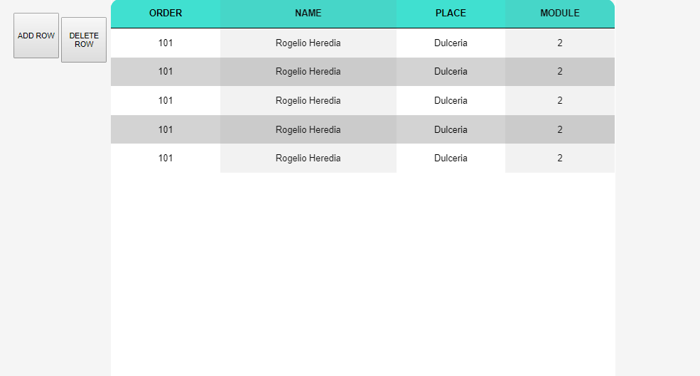
At last we have a basic bootstrap css table with dynamic addition and removal of row data. The dynamic effect is an appealing fading effect. So it looks as if the new data is not added but revealed from hidden layout. You can’t reduce the table layout to a single or two column layout. So the css table offers fixed layout for its header. Therefore making it suitable for situations where you can’t afford to change the layout of the table structure. There’s no extra border for this table since the content color itself forms that in this css layout.

Conclusion
Hence that was the final one on the responsive table examples. These examples are applicable from admin panel layout to attractive pricing cards. Since both code and demo were available for each of above examples we hope you went through them and got clear idea. Each has its own benefit and may have certain limitation. Go ahead and tell us what you feel on today’s article of responsive table design in comment below.
